I am proud to be the lead designer for the CRA direct deposit project and played a key role in helping our customers navigate through this difficult time with the financial support they require. UX is actually making a positive impact on the world.
We launched the new CRA direct deposit enrolment feature for Personal Banking customers in ~1 week on OLB and followed up 2 weeks later with Mobile. We had over 363K total CRA registrations across both channels. Additionally, we also launched direct deposit enrolment feature for Small Business customers with new designs, in just 9 days.
Project Background
My Role:
Lead UX Designer
Collaborations:
More than 10 teams, including Engineers, Platform Team, Scrum Team, Design Team, Content Team and Marketing Team and etc.
Platform:
Online Banking (OLB)
Mobile Banking (APP)
Benefits:
Customers would be able to register and get their CRA benefits directly in their accounts without having the need to go out.
Team Goals:
Our priority is on delivering essential functionality to customers quickly rather than on achieving perfection out of the gate. We want to help the Canadian government to reduce the burden during COVID-19 as well as provide additional support for our customers.
What’s a direct deposit?
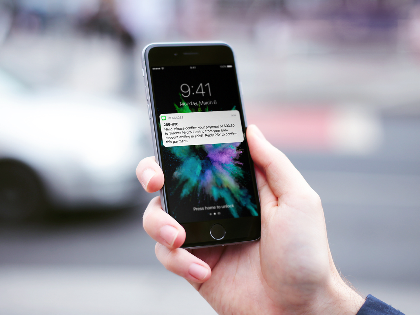
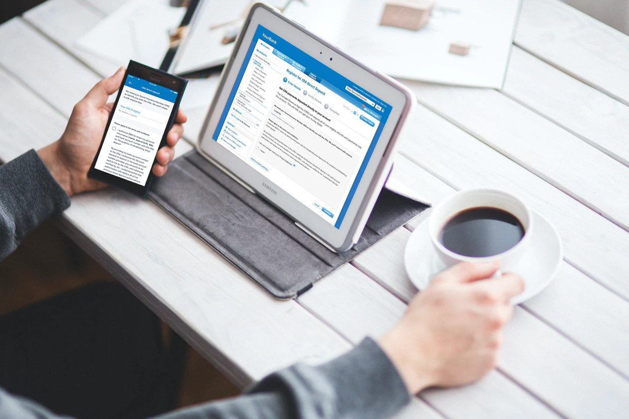
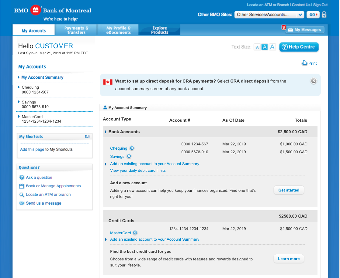
Direct Deposit is a convenient, reliable, quick way to access your money no matter where you are. A recurring direct deposit is when money is automatically deposited into your account at regular intervals. Once enrolled, individuals will receive CRA payments such as benefits, credits and refunds deposited directly to their bank account, and will no longer receive cheques in the mail.
User Problem
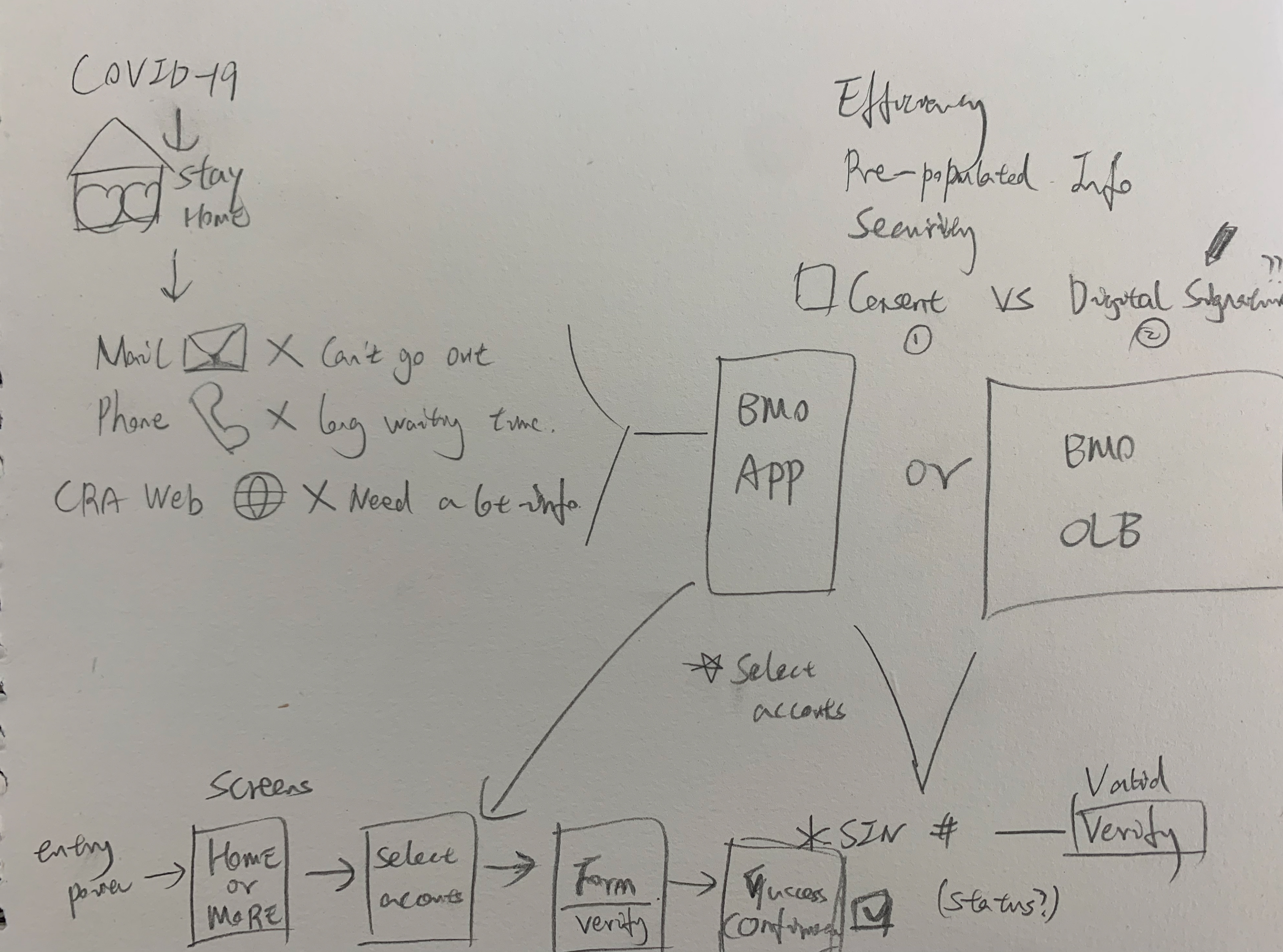
Receiving money from the CRA is not easy or fast in the current situation, users can only register through the CRA website through a long registration form or register through a mailing service and wait until CRA received their paperwork through Canada Post in the mail. Then users need to wait for a cheque to arrive and going to a branch or ATM to cash the item. It might get delayed due to unforeseen. circumstances such as bad weather. We'd like to provide a reliable digital solution and make sure all payments will always be deposited in the account that they supply at the time of their enrolment in direct deposit.
People that are experiencing financial hardship due to COVID-19 are eager to use CRA direct deposit solution to access funds faster and more directly.
Research
Current Situation
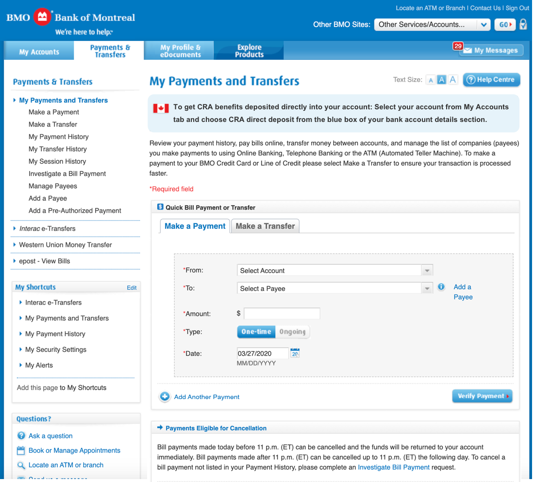
Before we started the project, unfortunately, none of the five big banks in Canada offer the CRA direct deposit feature in the market. In light of COVID-19, the CRA has asked all financial institutions to offer the ability for customers to set up direct deposit by completing an enrollment form in OLB and Mobile. This is time sensitive and the CRA is looking to start using capability in April, expecting to cut $30MM cheques a month. CRA’s goal is wide adoption of the service and wants us to update customer messaging and communication accordingly.
Competitive Analysis
TD: Asks customers to find their Account and Branch number in EasyWeb and the TD app, and they need to call their call center to register. (not a digital solution and not effective)
CRA website: allow customers to register through their digital registration form, however, the form is super long and redundant asks a lot of information.
Desjardins: offers a digital solution through online banking, customers select account first and input their social security number then register.
Strategy Phase
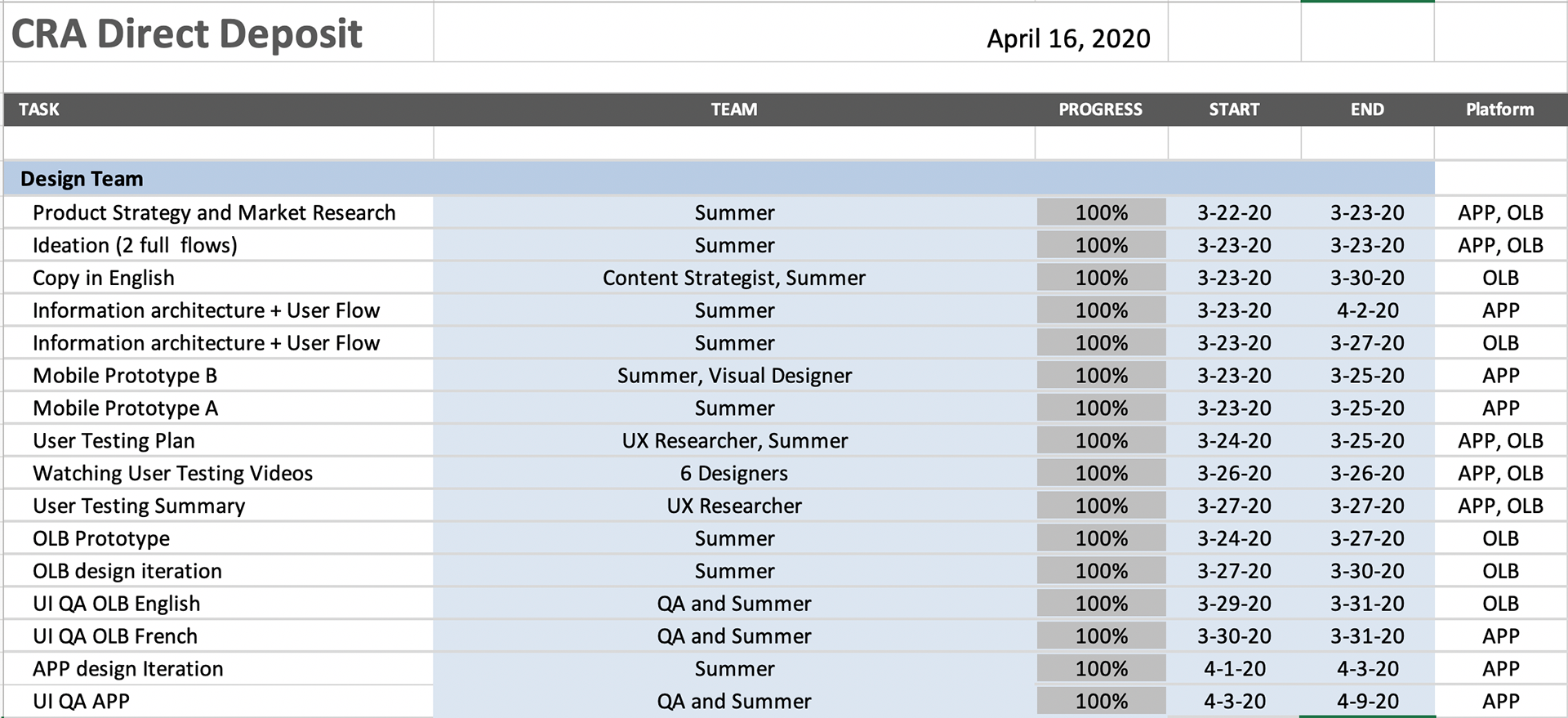
I received this urgent project call on Mar 22 and started to brainstorming the product strategy and ideate possible solutions to deliver a feasible experience to customers as soon as possible within our current tech capacity. Our project goal was to deliver everything by April 15 to support the Canadian government. So I decided to skip the sketched wireframe and paper prototype, I grabbed the design component from our design system quickly drafted two versions of the mobile app and the user flow. On the second day in the morning, our team presented to the E-levels.
Besides the design deliverables, I spent most of the time coordinating with different teams and manage project timelines and arrange designer resources to make sure the project design parts were delivered on time.
Challenges
Complex challenges are uniting and inspiring me. These are seen as opportunities rather than obstacles.
1. Tight government deadline required monumental effort, dedication and sacrifice – for many of late nights, weekends, and juggling priorities at home to work around VPN limitations.
2. Cross team communications, this project involved more than 10 different teams
3.Resources management and coordinations between people and teams
4. Design trade-offs during product development phase
Another critical challenge was to build an online solution that should match to the mental model of the primary users and especially within their technical capability. So that they could complete their task with 100% efficiency and success ratio. Since we didn’t have the scope of even 1% failure rate, this became the biggest challenge for us.
Target Users
1. People who are expecting to receive refunds and payments from CRA urgently
2. People who has working income tax return benefit and child benefit
Design Process
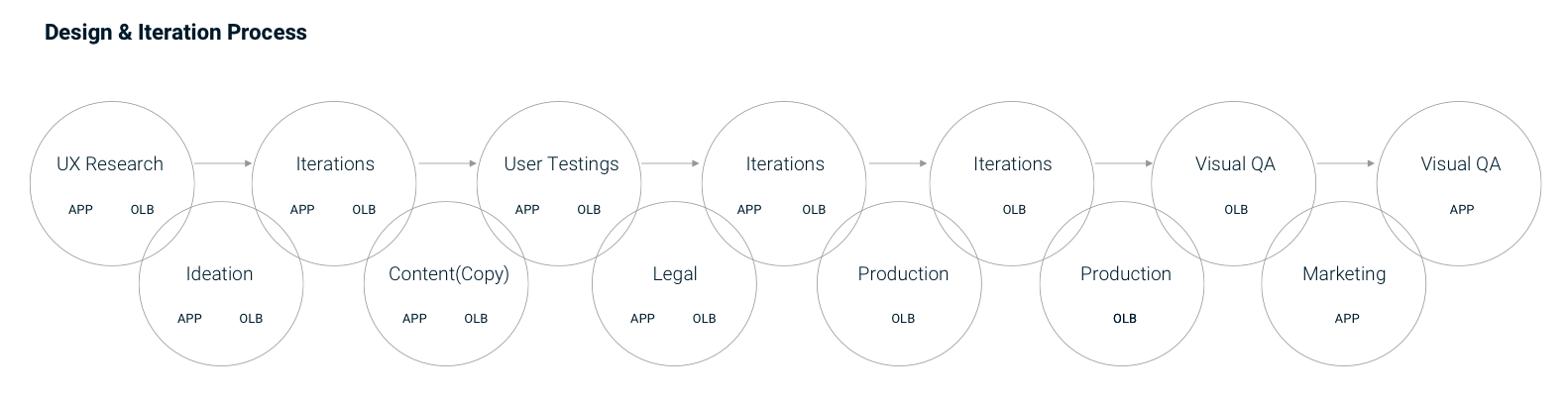
Sketches
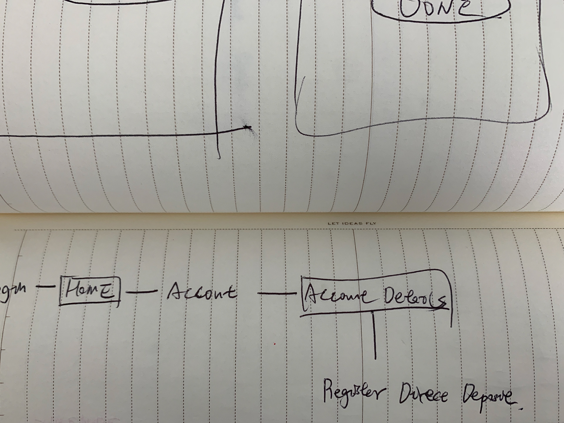
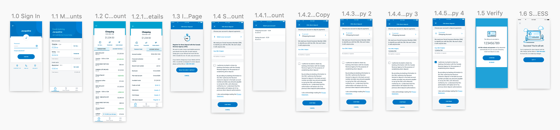
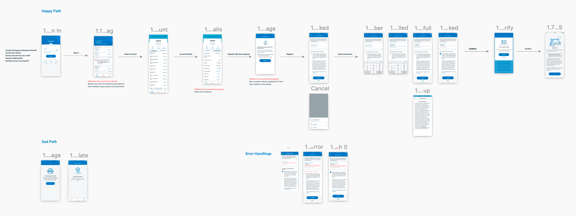
Initial Ideations APP
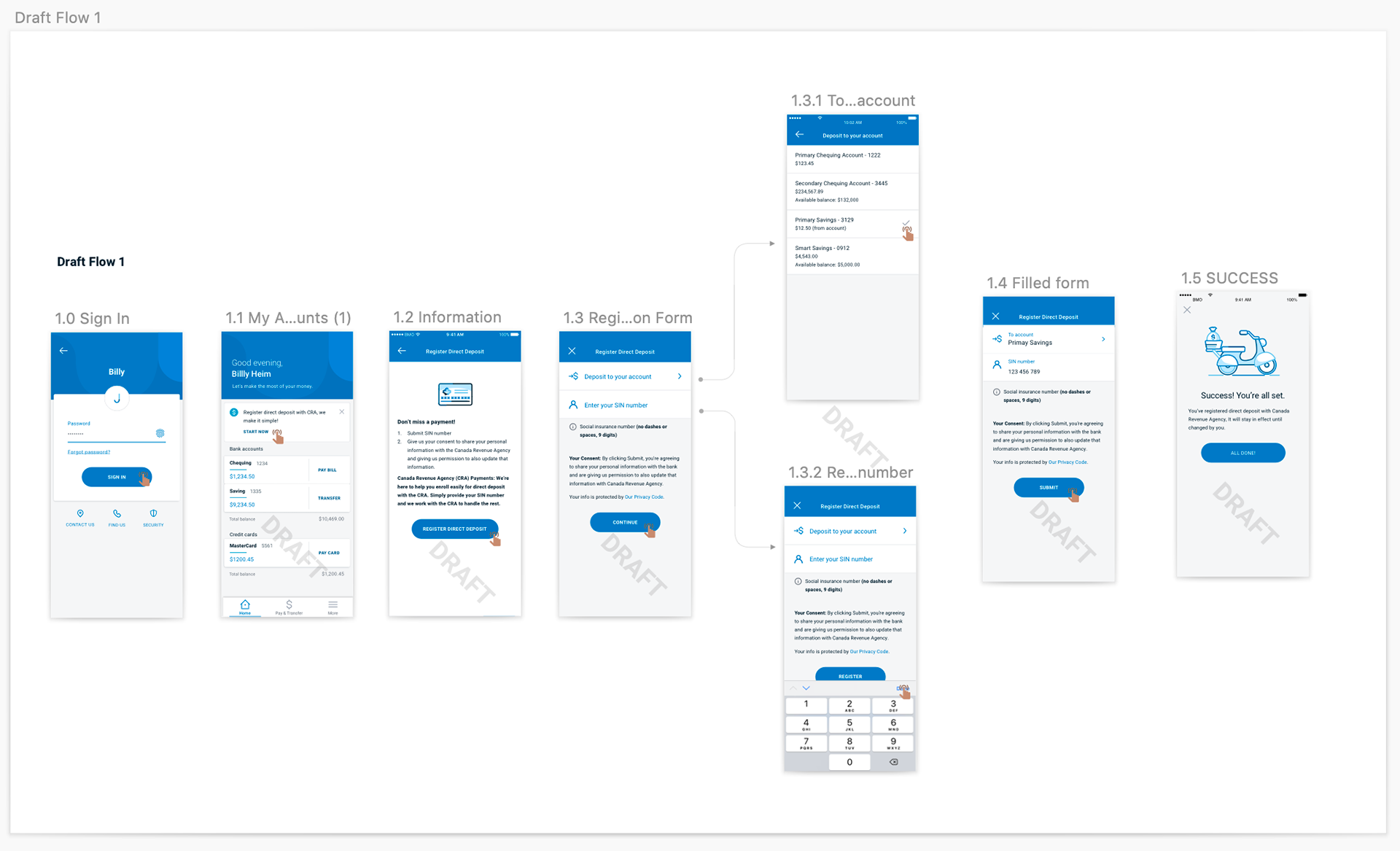
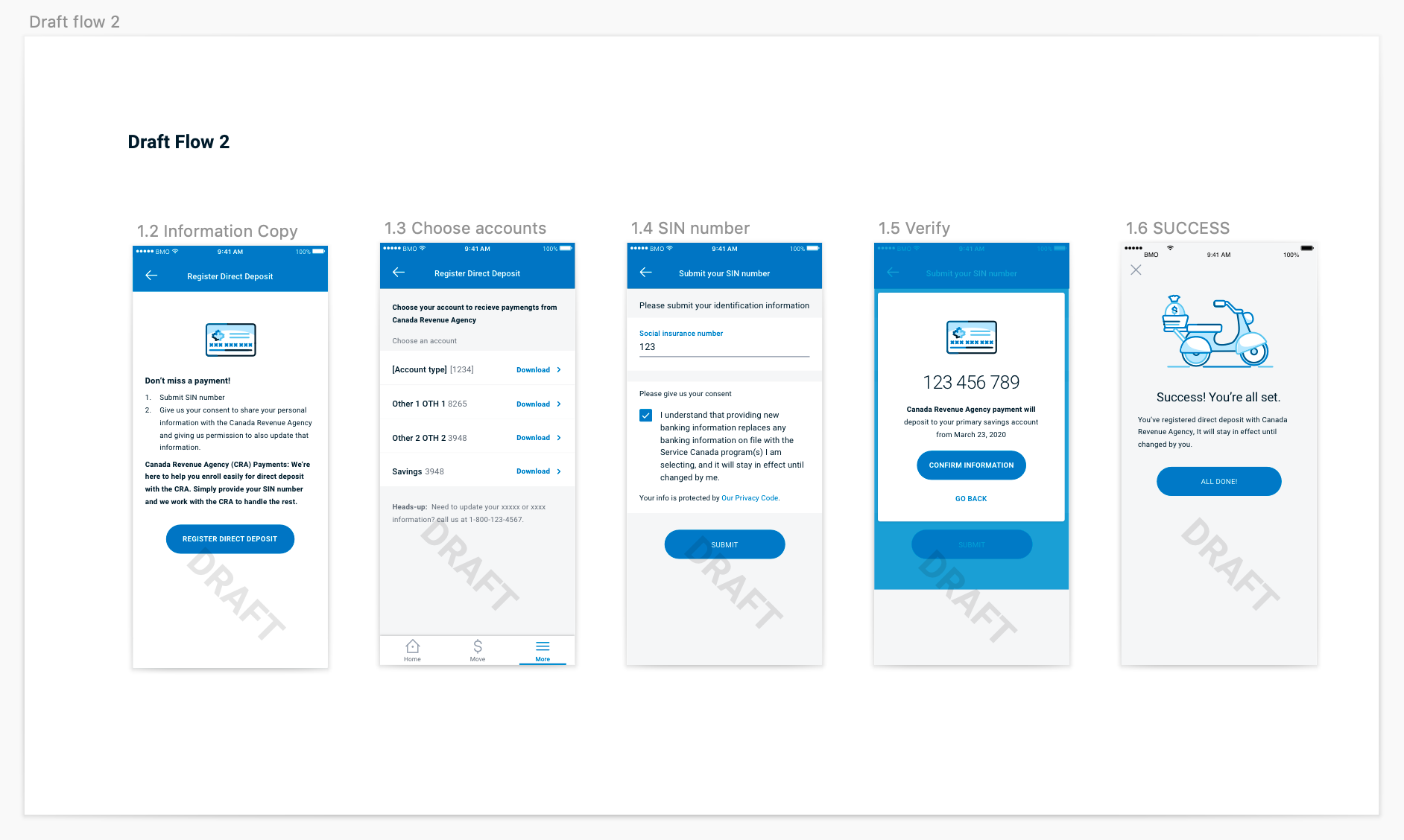
Due to the urgency and short time frame, I started with the mobile version since we already have an existing design system and some patterns available to reuse. drafted different entry points and two draft flows including different user interactions and logics.
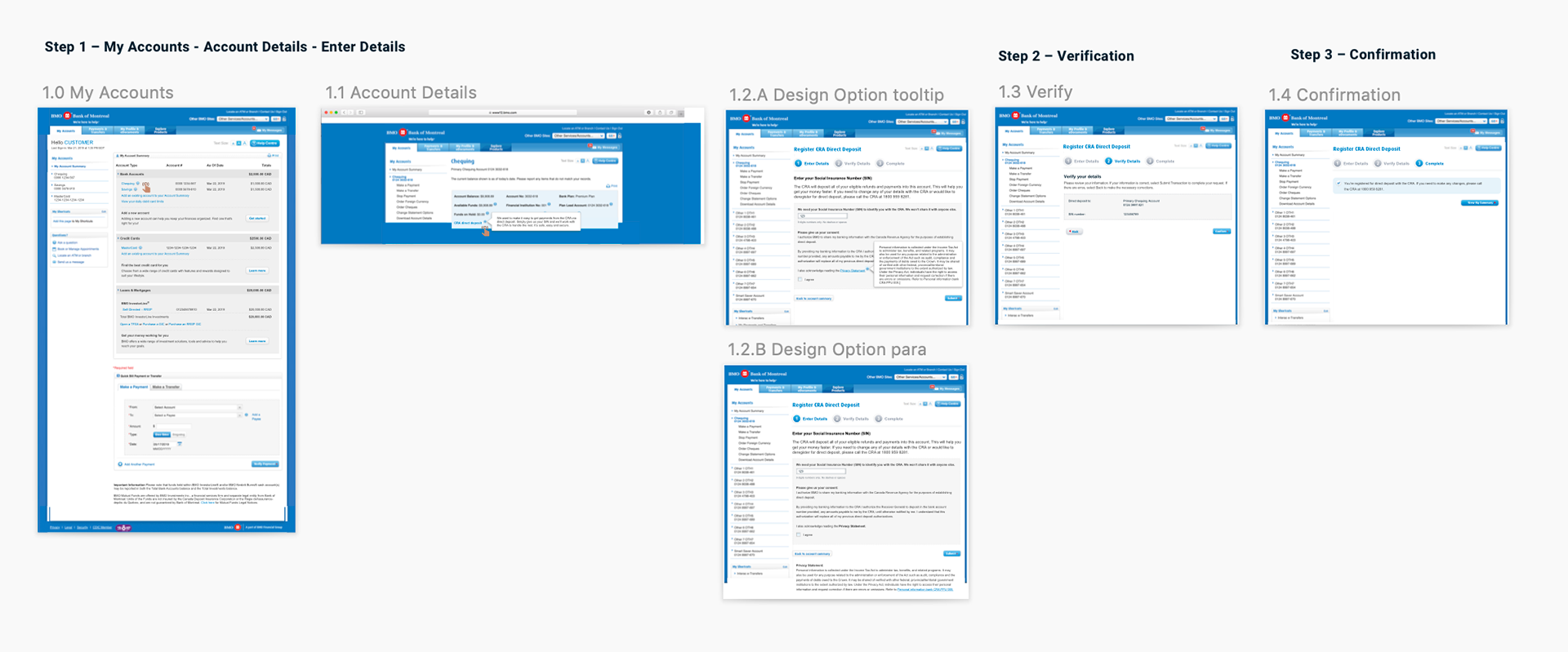
Initial Ideations OLB
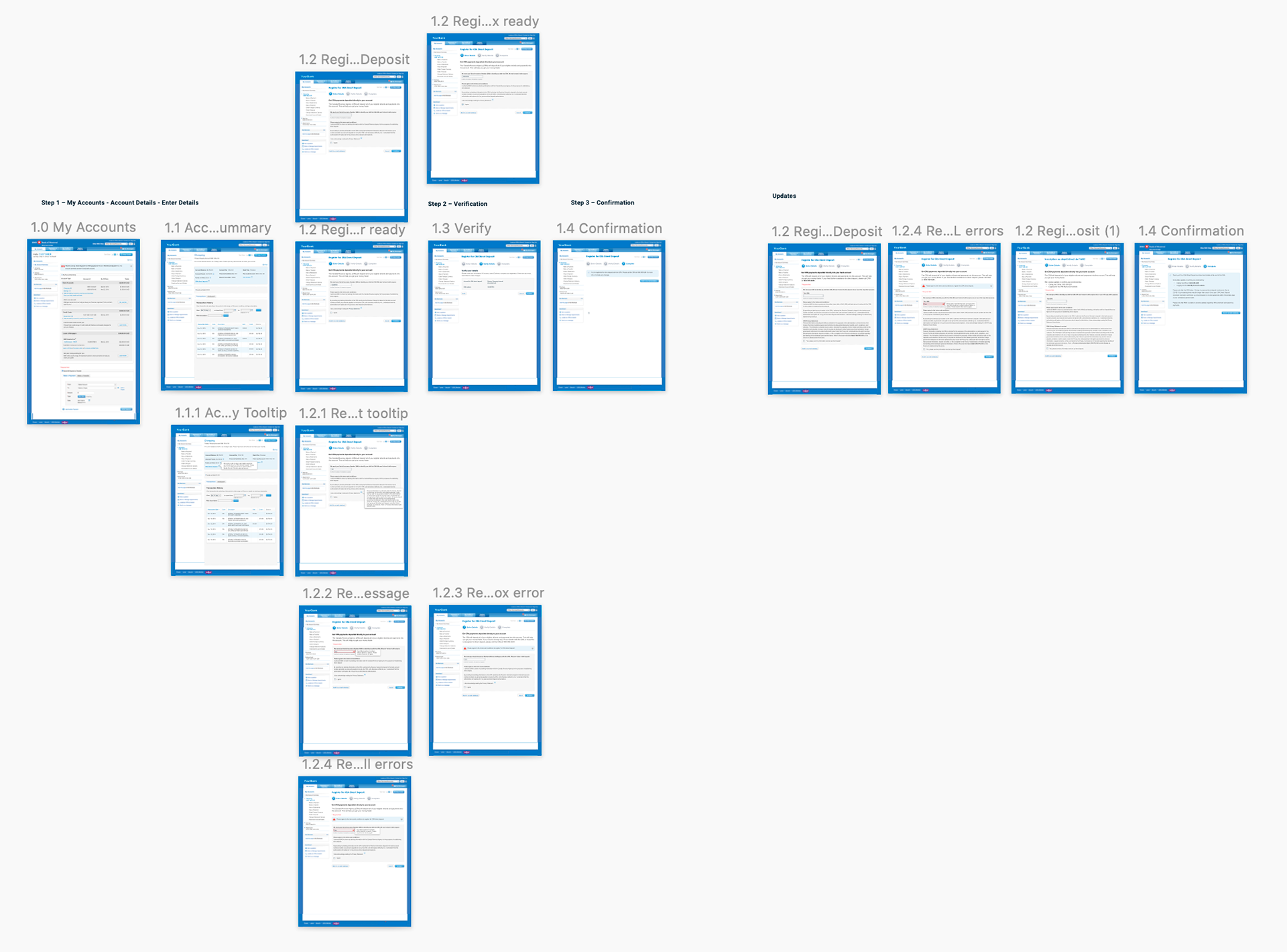
Our online banking platform is not using recent technicals, so I decided to only provide quick partial mockups for engineers in the first design version to save everyone's time. At the same time, I supervised 1 visual designer with the clickable prototypes while I was working with one UX researcher and one content strategist to finalize the content and conduct user testings together. With the agile working process, I handled cross-team communications effectively.
A/B Testing
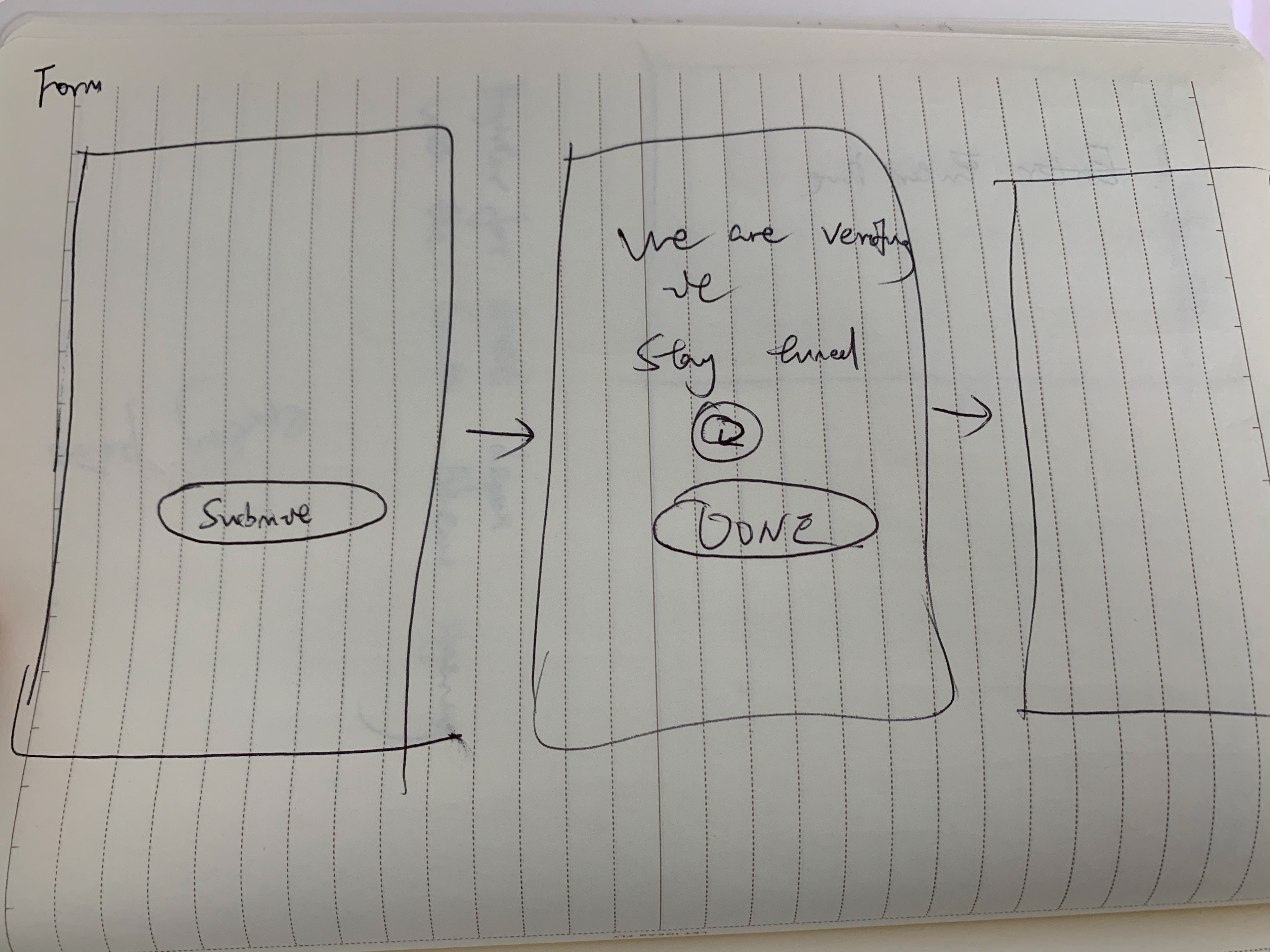
Prototype A
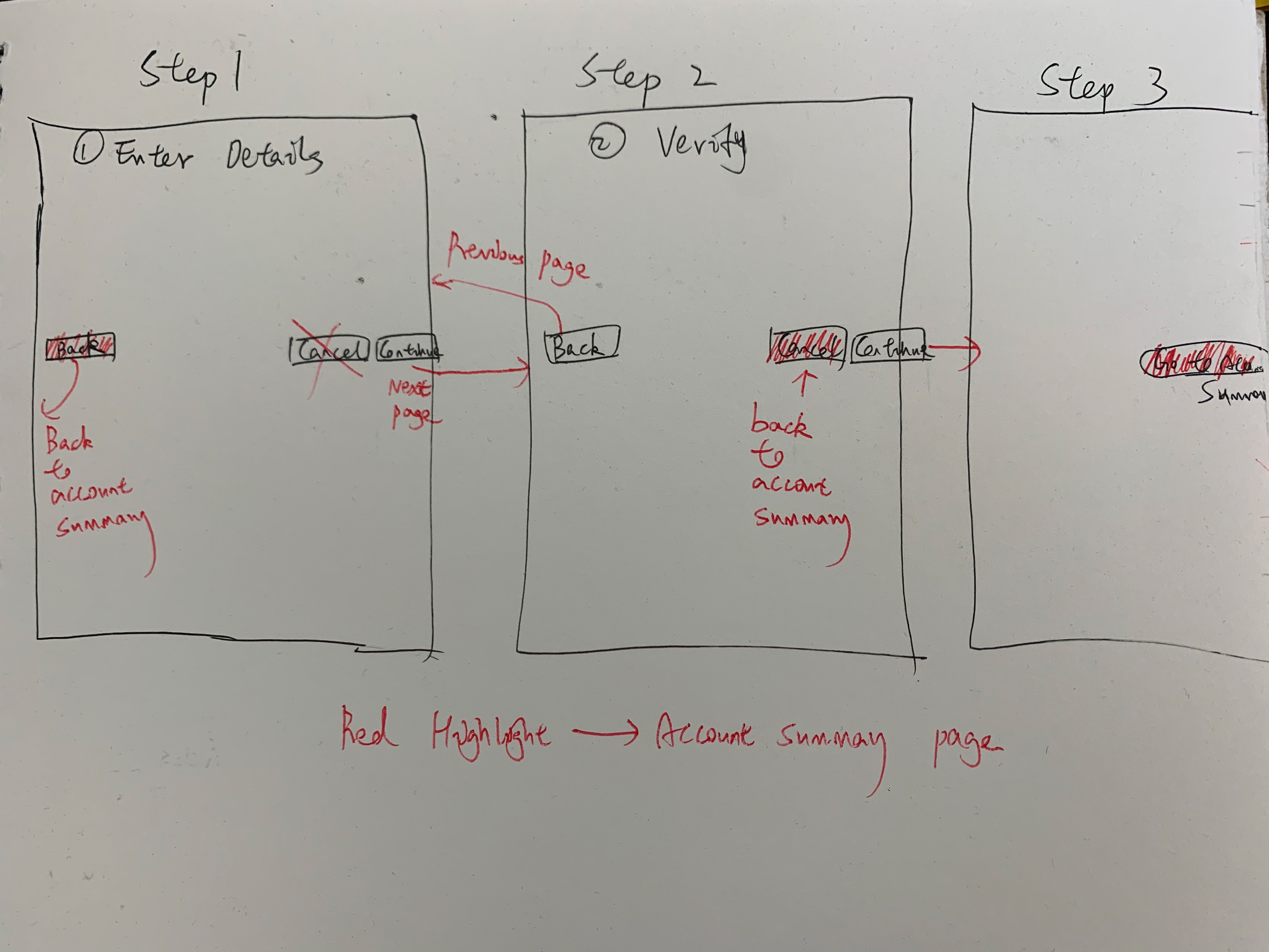
After several iterations between the initial drafts and the high-fidelity prototypes, due to tech limitations, both the business and tech sides were requesting to put this feature under account details to save back-end engineer's time.
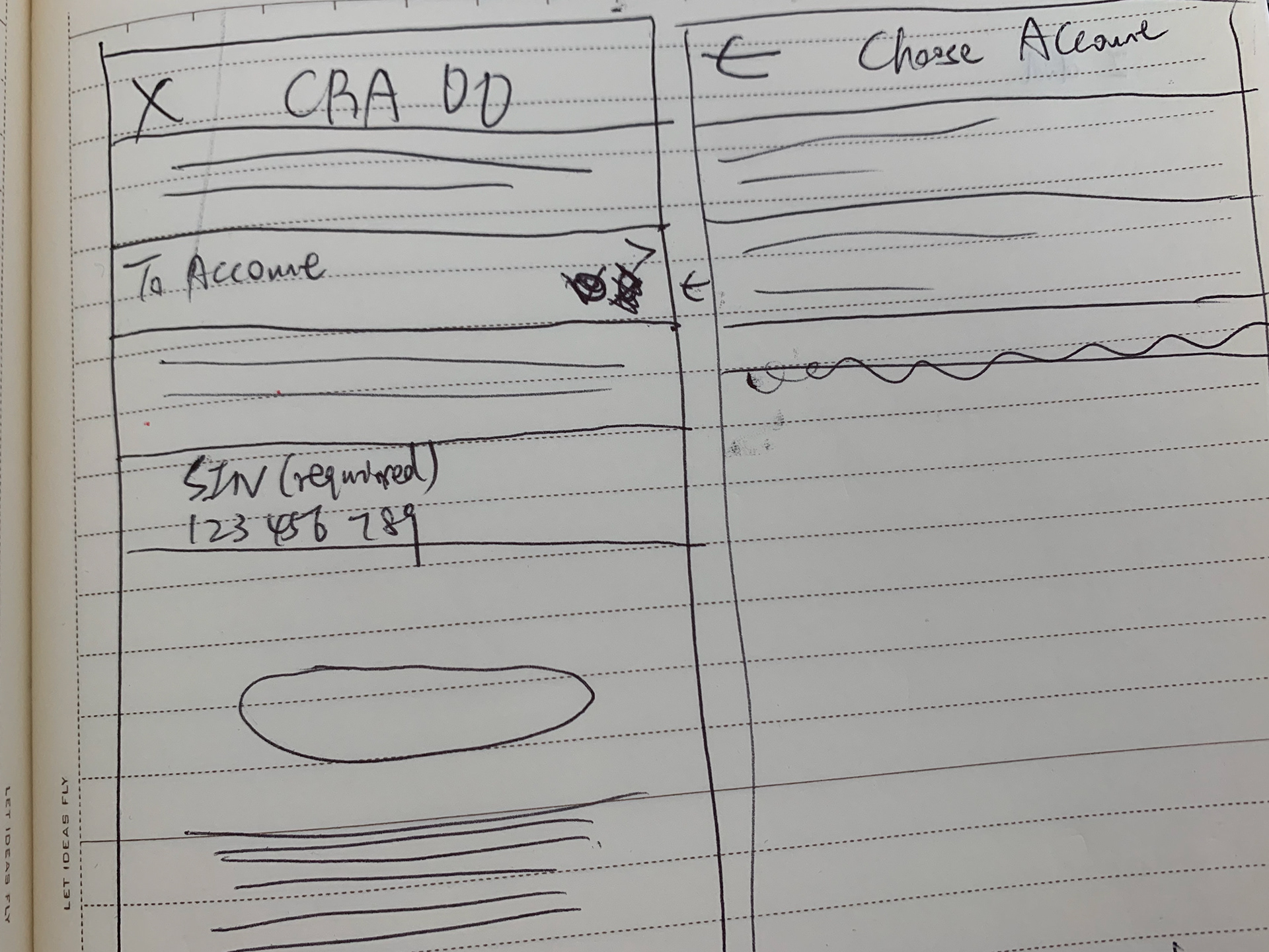
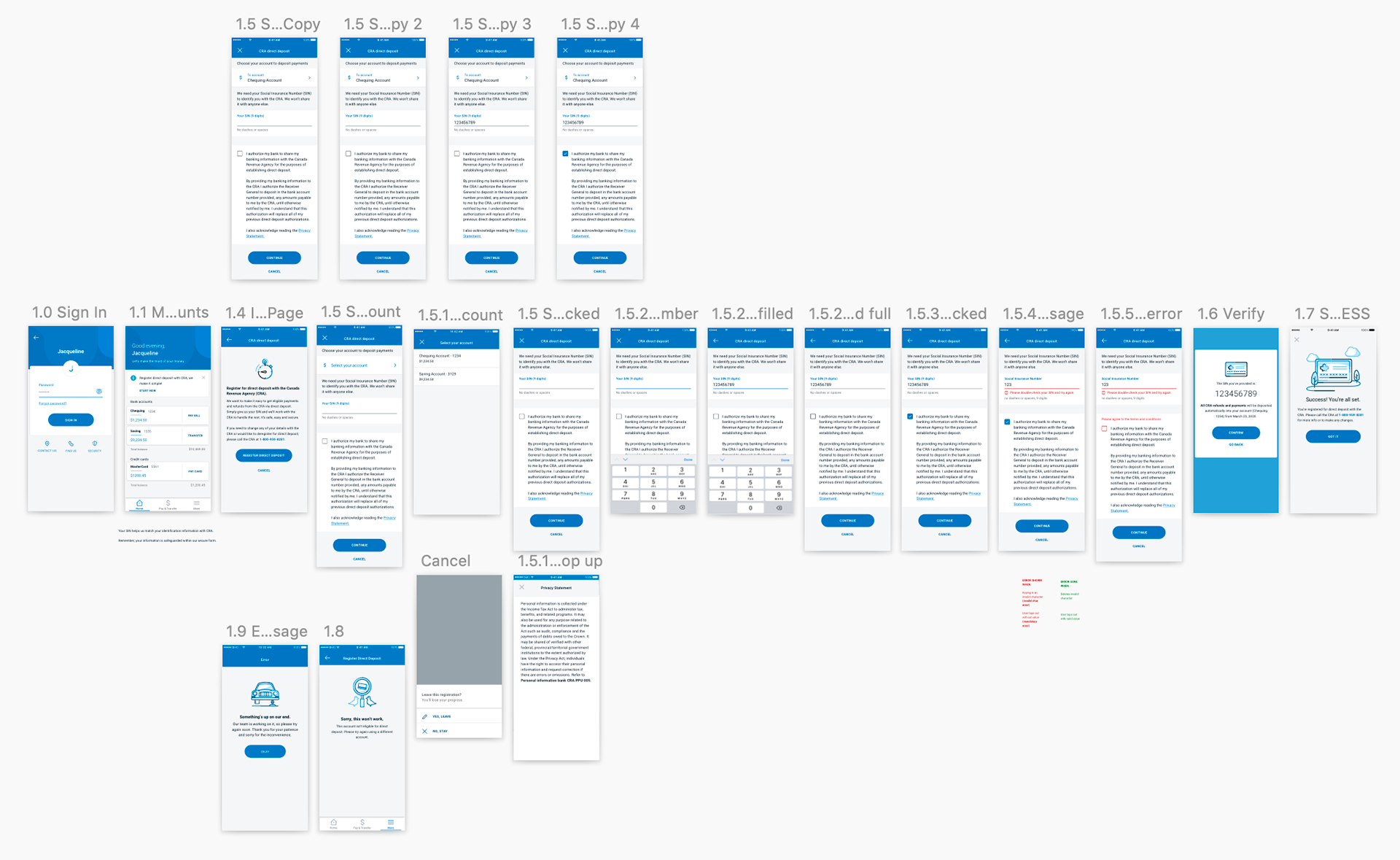
In version A, users select their deposit banking account after launching the feature and input Social Insurance Number(SIN) next. In the prototype B, users select their banking account first, and then they enter the SIN to register.
Another difference is that there's a banner with hyperlink on the home screen for prototype B to direct users to register. All versions of the test were using the same set of questions. This would help us identify how many Version B participants notice and mention the banner without any prompts or comparisons in mind. I assumed users would prefer the options with the banner to find out where the feature is existing. The A/B testing was also a part of my design assumption validation.
The research result of prototype A(hidden under account details) showed that 67% of users couldn't find out where to start without a link.
Prototype B
Design Refinement
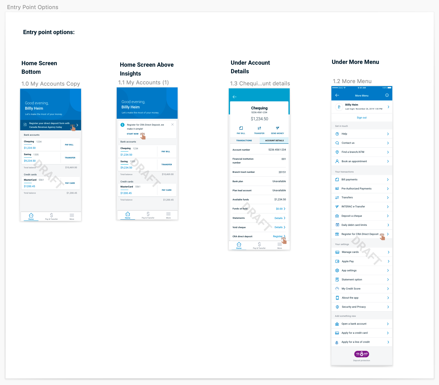
After we tested the two prototypes, I conducted a design thinking workshop within my project team to discuss the options for other entry/trigger points. Before we made the final decisions to the entry point under account details on both OLB and mobile, as I mentioned above, I discussed the design team, solution architect, and engineers about the discoverability of the feature. Below were my proposals after the project team decided to put the feature under account details because of time limitations and tech constraints.
Feature discoverability proposals
This part focuses on feature discoverability – not the technical flow or function.
If users can’t find this feature, they will increase call center volumes, which were already overwhelmed with support calls. These clients were likely in a state of stress and would have reduced capacity to search for a feature that the government has been promising them since March 25.
Not surfacing where and how the feature works, will result in significant complaints on social media and will reflect poorly on BMO’s reputation and overall purpose of “Growing the Good in Business and in Life”. Other banks are already better positioned in their post-sign on messaging of COVID-19 support than we are and this is likely a moment of truth for many of our clients.
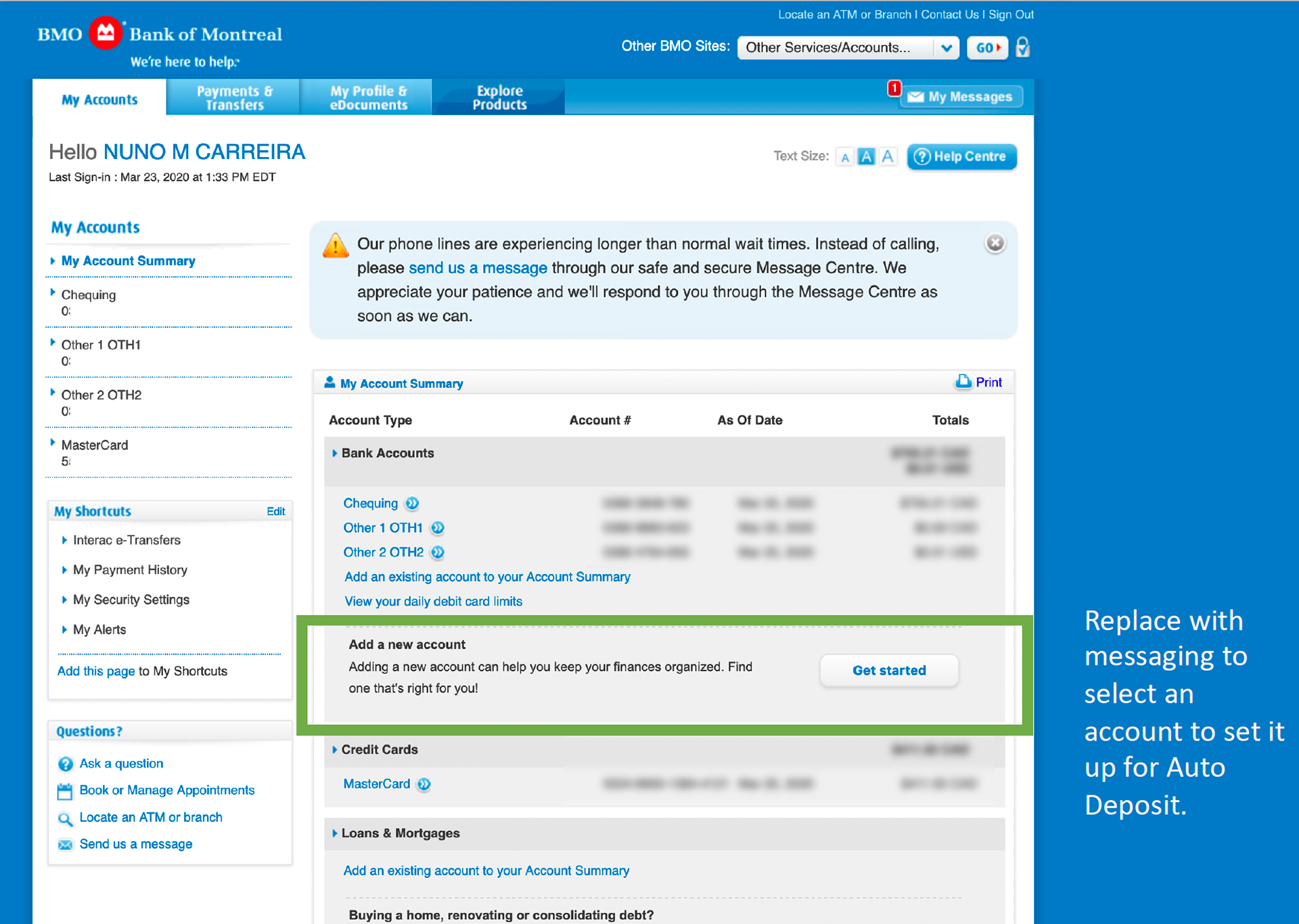
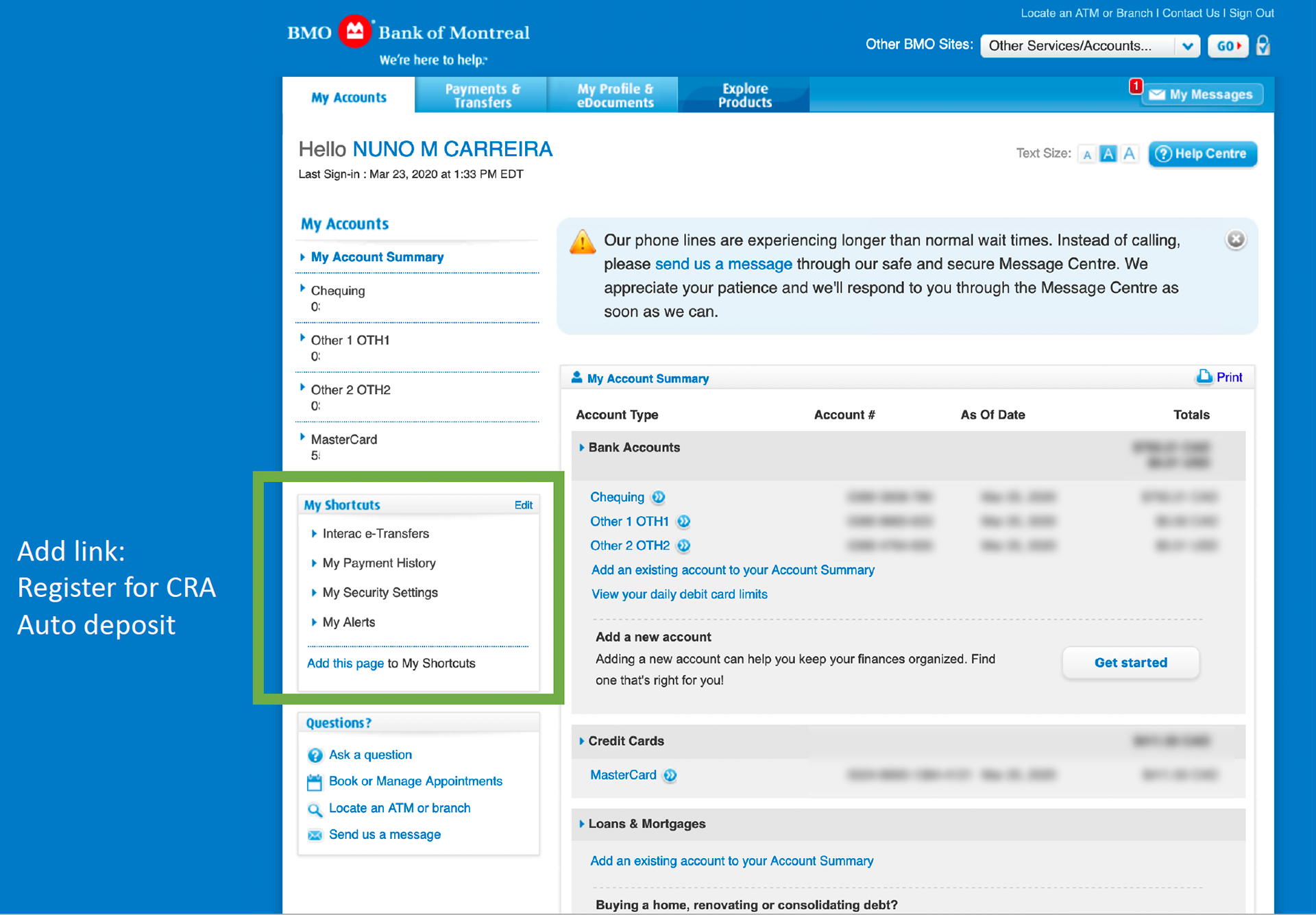
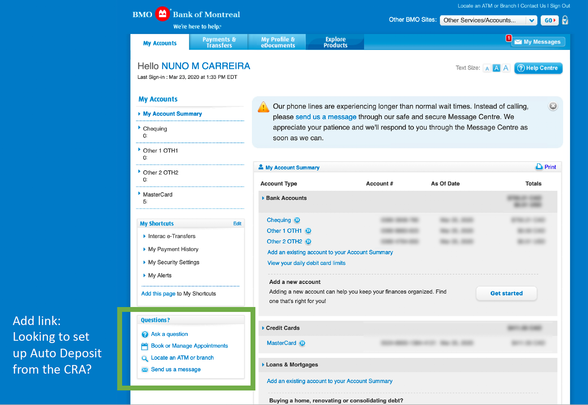
Final Discoverability Solutions
User Testing Research Plan:
We tested two mobile prototypes, one with banner(prototype B) and one without banner(prototype A). The following key areas will be tested:
Understandability: do users understand what this feature is for?
Discoverability: can users find the feature?
Usability: can users complete the registration?
Next steps: do users know what they have to do after completing their registration?
User Testing's Insights:
We asked participants how we might improve the OLB & mobile prototypes. All participants left a comment related to discoverability. Based on takeaways from qualitative notes, discoverability is poor for version A with no banner. 67% of participants (10 of 15) clicked on the More menu and moved on when nothing happened. Many that were successful landed upon the CRA direct deposit link by chance as they were clicking back and forth between Chequing account summary and details, and scrolling up and down.
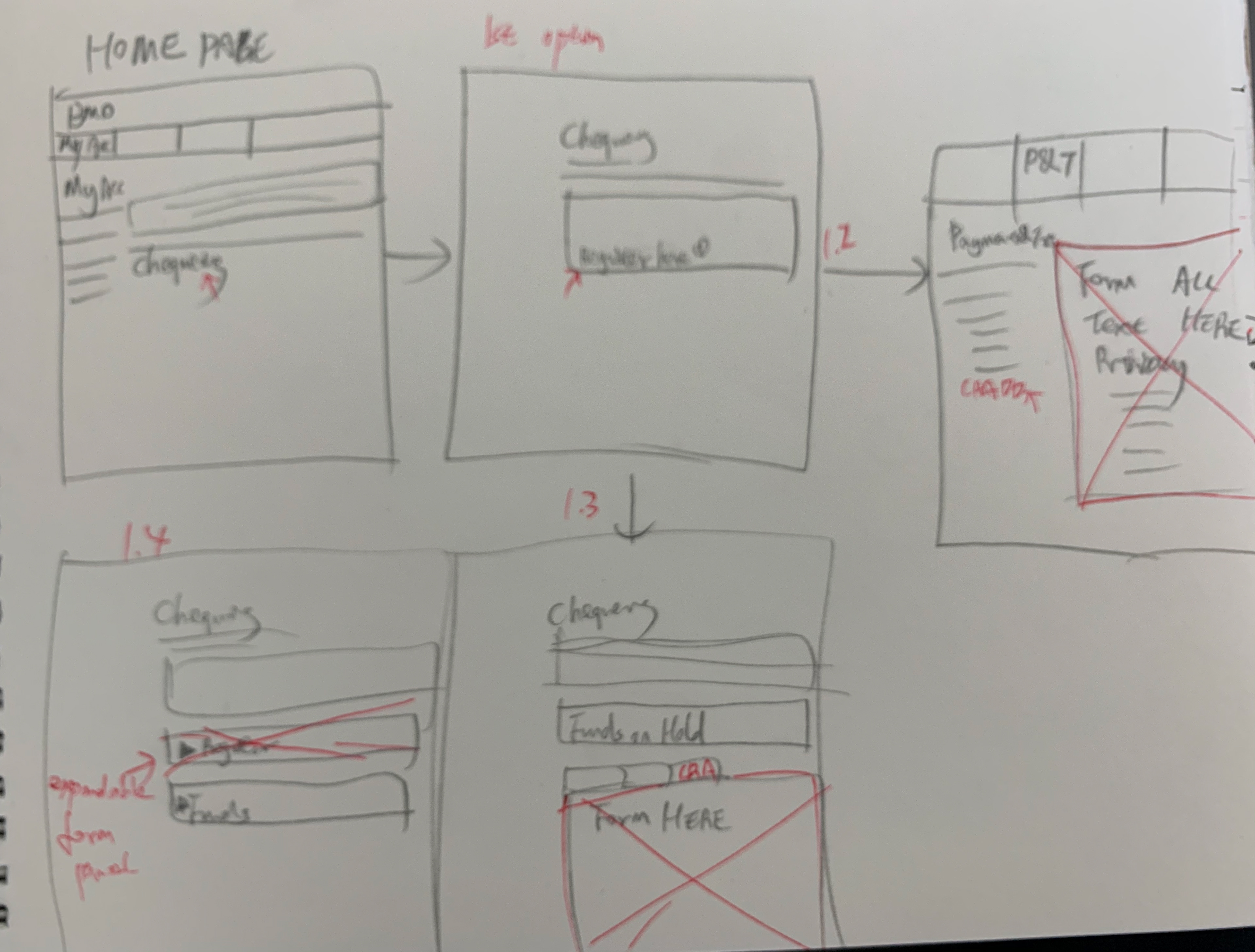
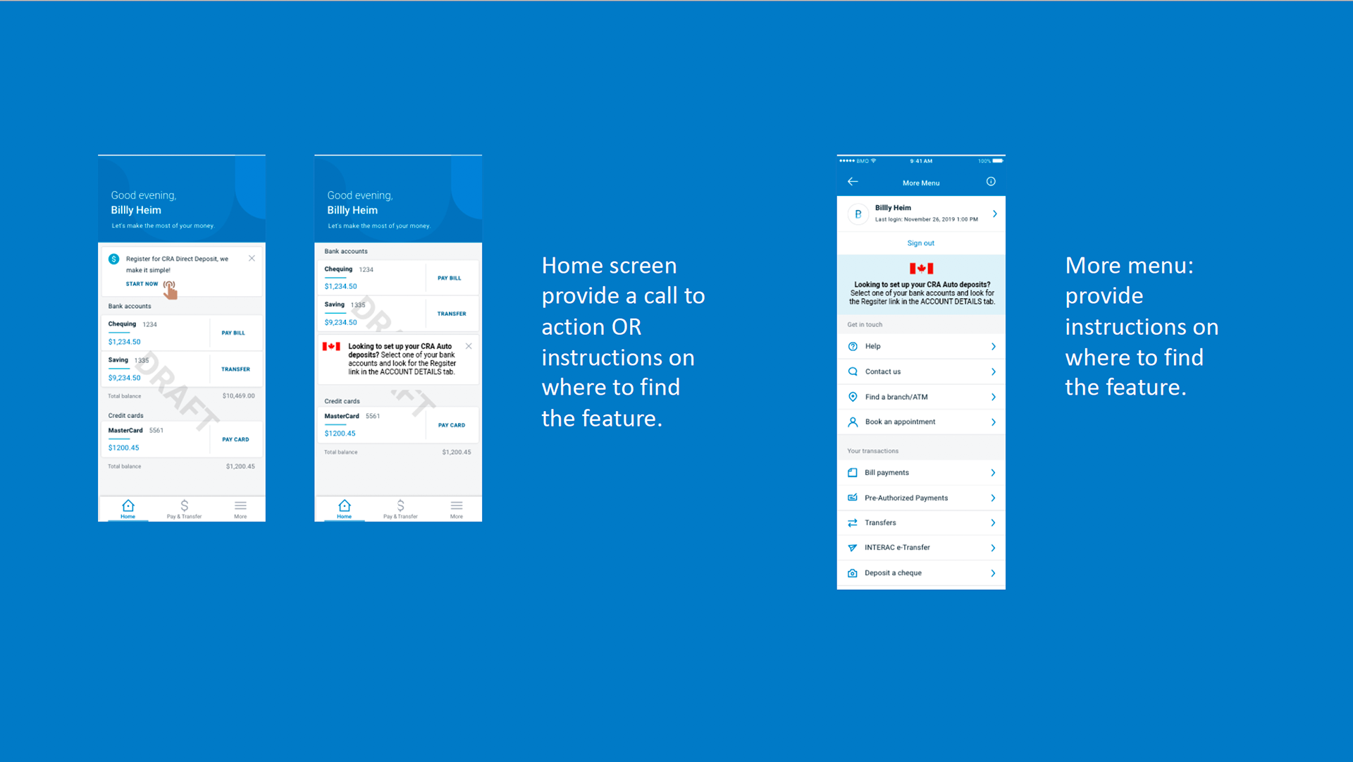
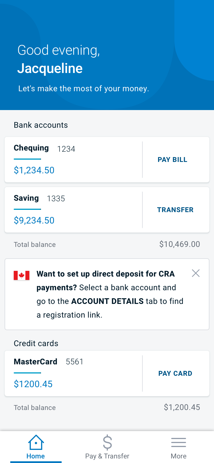
Based on the research insights, if we decided to keep the entry point under account details due to tech limitations, we have to find a good approach to guide users there. So I decided to add a text banner on the home screen to guide users and also secure the project speed for both mobile and OLB versions.
Added a banner with text instruction at home screen to guide people to go to account details to register.
Added a banner with text instruction under the "My Payment & Transfer" tab's home screen to guide people to go to account details to register. During user testing, there were 75% of people clicked "My Payment & Transfer" without a banner so I made the design decision to add another banner under that tab to guide people in case they missed the one on the account home screen.
Accessibility
1. Meaningful links
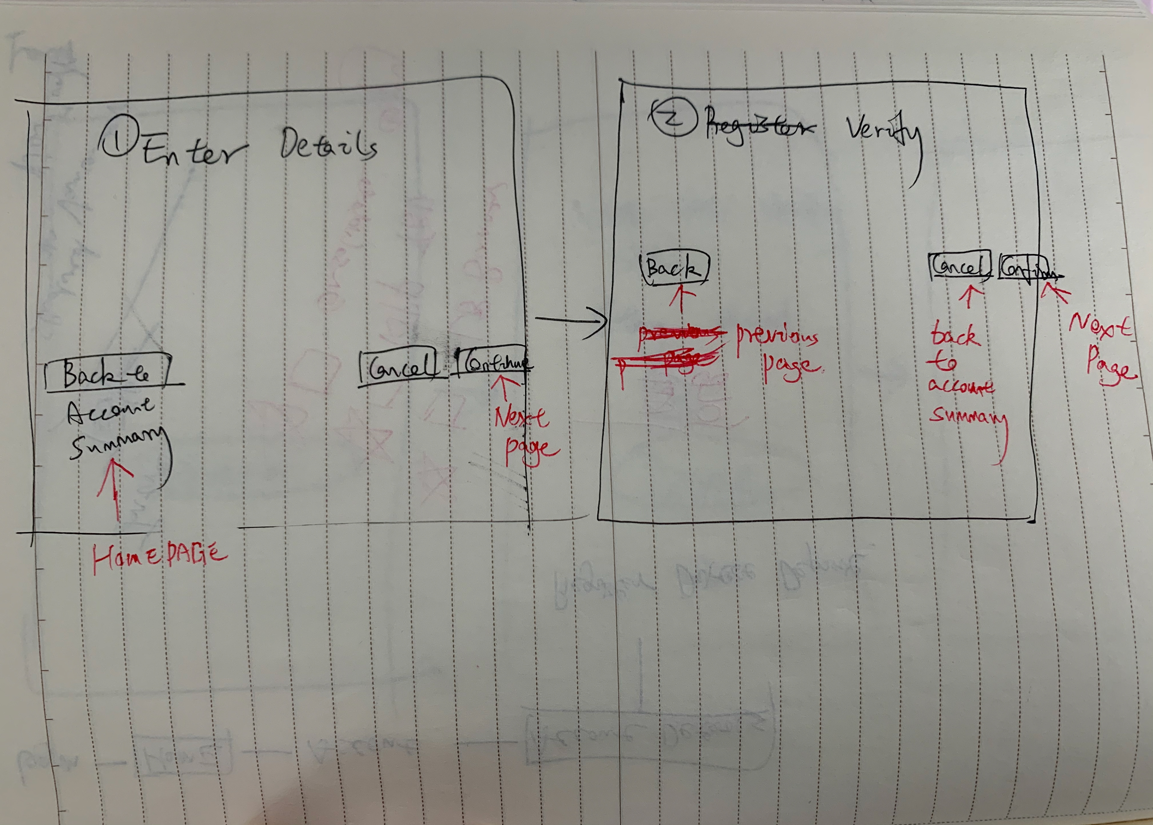
Avoided links that say ‘Click here’, make sure all links are including meaningful content, such as "continue", "next" vs "register" in every step, especially in OLB.
2. Consistent Navigation
I ensured that repeated navigations occur in the same order on each page of the app. It is helpful for users with cognitive limitations, low vision, and intellectual disabilities as it becomes easier to predict where they can find things on each page.
3. Use of headers
I used descriptive and informative page titles on both App and online banking platforms.
4. Interactions
I refined the tooltip design on the OLB into a pure text form because 1. It won't disrupt the user's page experience which can help users with low vision or cognitive disabilities; 2. From technology's perspective, it is not possible to pass the accessibility guideline with a tooltip design on the page level for this specific project.
5. Layout
I designed the layout in a linear and consistent way, also made sure the content is clear in writing; avoided jargon and idioms which is useful for screen reader users.
Iterated screens APP
Iterated screens OLB
Result
Receiving money from the Canada Revenue Agency (CRA) has never been easier with BMO CRA direct deposit feature. Whether you’re due for a relief payment — like the Canada Emergency Response Benefit, the Canada Emergency Student Benefit or the Canada Emergency Wage Subsidy — or are waiting on your tax refund, you can set up direct deposit with the CRA to get your money faster.
Benefits to users
1. Access money faster – no waiting for a cheque to arrive
2. Save time by reducing user's trips to the branch
3. Reduce the chances of a lost or stolen cheque
Impact
This is the measurable, definable real-world impact of UX. The CRA deposit feature is critical for enabling customer access to much-needed government funds during this difficult time.
This went beyond user experience. This was designing a system to get people the aid they need during a global crisis.
Together, we delivered a feature that required partnerships across 10+ teams, with impact up to 70% of Canadians, all within ONE WEEK - faster than even RBC and TD.
We launched the OLB version on April 1st and the Mobile version on April 15. Until April 15, there are more than 200,000 cumulative submissions through online banking. BMO represented 25% of the full volume from CRA while we only represent 12% of the total Canadian customer base. That is an extremely good result as a KPI.
Initial results on mobile usage are strong, with 256,000 total CRA submissions for CRA (Personal Banking), with 40,000 from mobile in 10 days since app launch. In total, we had over 363K total CRA registrations across both channels in about 1 month.
Kudos to me :)
CONGRATULATIONS to Summer! As of 2:00 PM, 20k BMO customers have registered through the CRA Direct Deposit Project you have been leading in the past couple of weeks. Thank you for crafting out such a simple and effective solution that enables customers to enroll in this life-saving program in just a few clicks. I truly appreciate your dedication, patience, and collaboration throughout the project. – Director of UX Design
In the past week, I have seen increasing team support, although we are not physically working together. I want to thank Summer for her hard work on CRA projects. You have been working day and night non-stop for the past few days to ensure delivering high-quality design work within extremely tight deadlines. – Sr UX Manager
Just wanted to share my sincere thanks to each and every one of you on the successful deployment. Your work on the CRA deposit feature is critical for enabling customer access to much-needed government funds during this difficult time. - Head, Digital Channels
Thank you to that you have brought this functionality to life while demonstrating how we continue to Boldly Grow the Good for our customers during these stressful times. You demonstrated great leadership skills in this project. - Head, Digital Experience
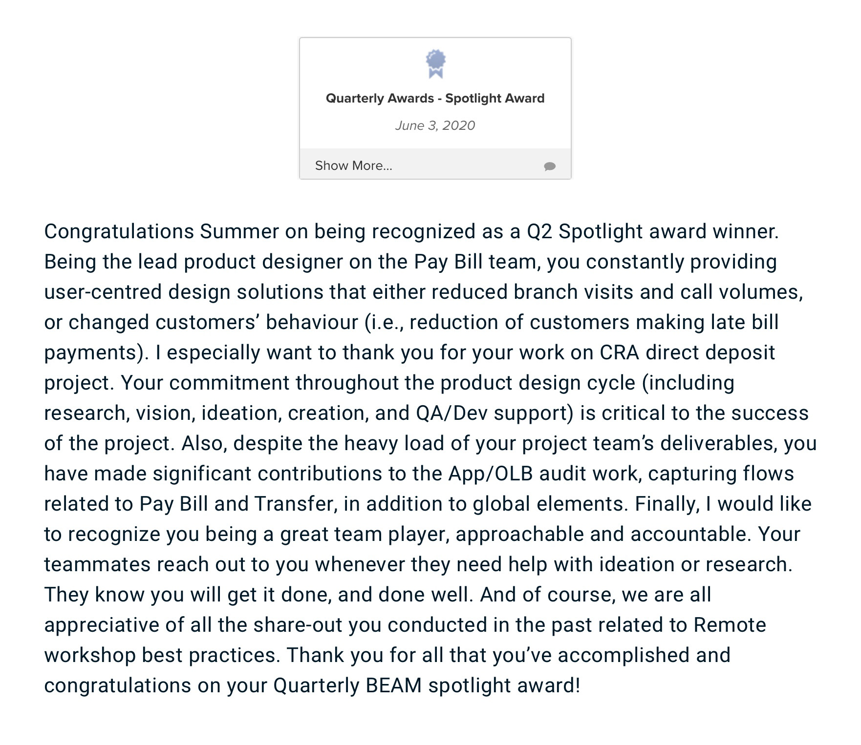
Recognized for BMO Q2 "Spotlight Award"
Related News
Features Introduction:
GST credit payments to low-income earners to arrive one month earlier:
How BMO is supporting customers:
If you'd like to learn more about this special project, feel free to ask me more details during the interview. I'd like to share how I handled the difficult working situation and the urgent project timelines, how I collaborated with different teams.