This is a UX Case Study.
My Role: Product Designer
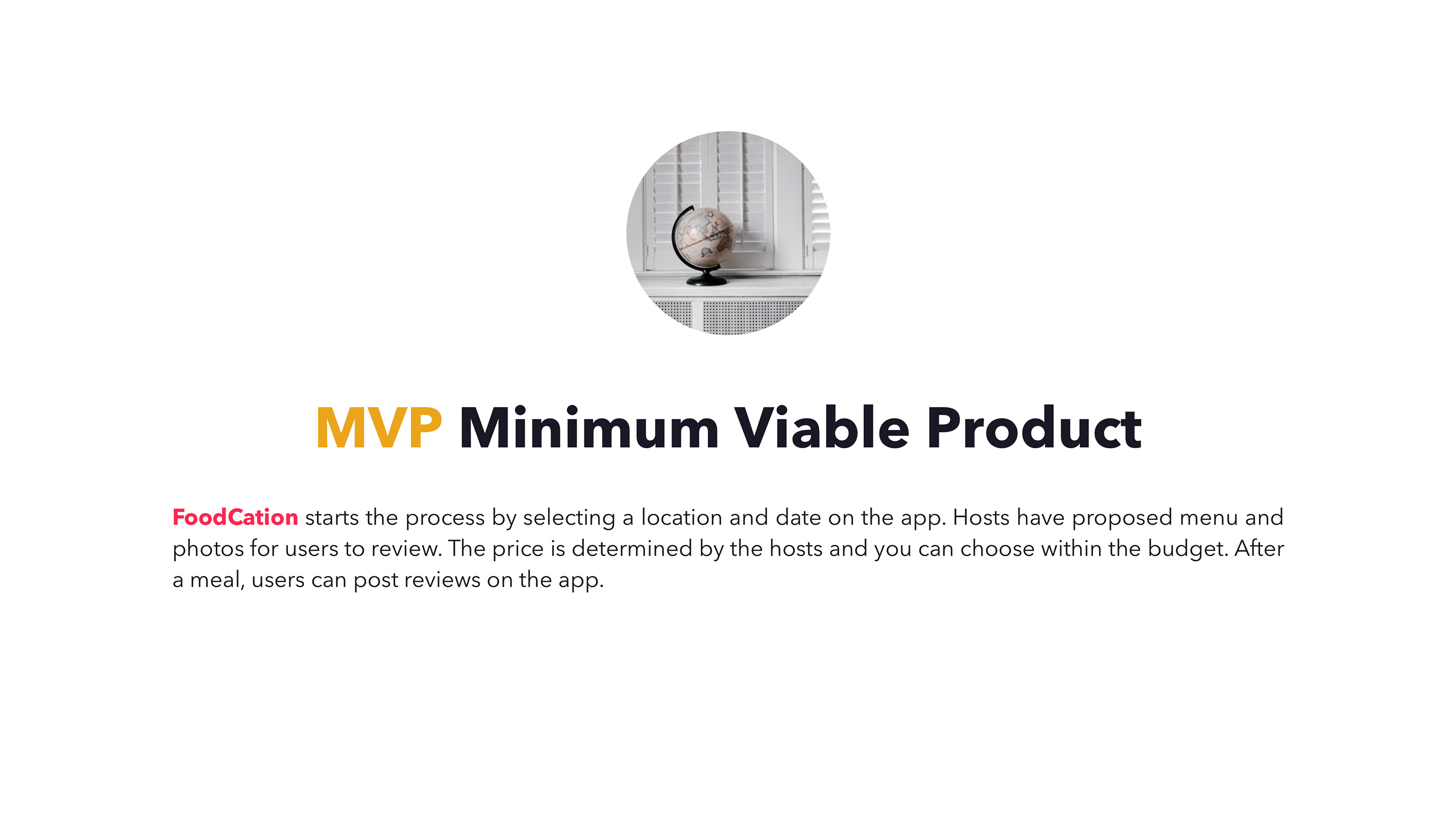
Project Description: FoodCation is a platform for travellers to eat at local people's homes for authentic local food. As a guest, you socialize and get to enjoy good food. At the same time, dining/meeting with locals can truly make a strange city feel like home, eating authentic food is the most enjoyable experience when traveling.
Introduction
FoodCation is a platform for travellers to eat at local people's homes for authentic local food. As a guest, you socialize and get to enjoy good food.
At the same time, dining/meeting with locals can truly make a strange city feel like home, eating authentic food is the most enjoyable experience when travelling.

What I Suspect
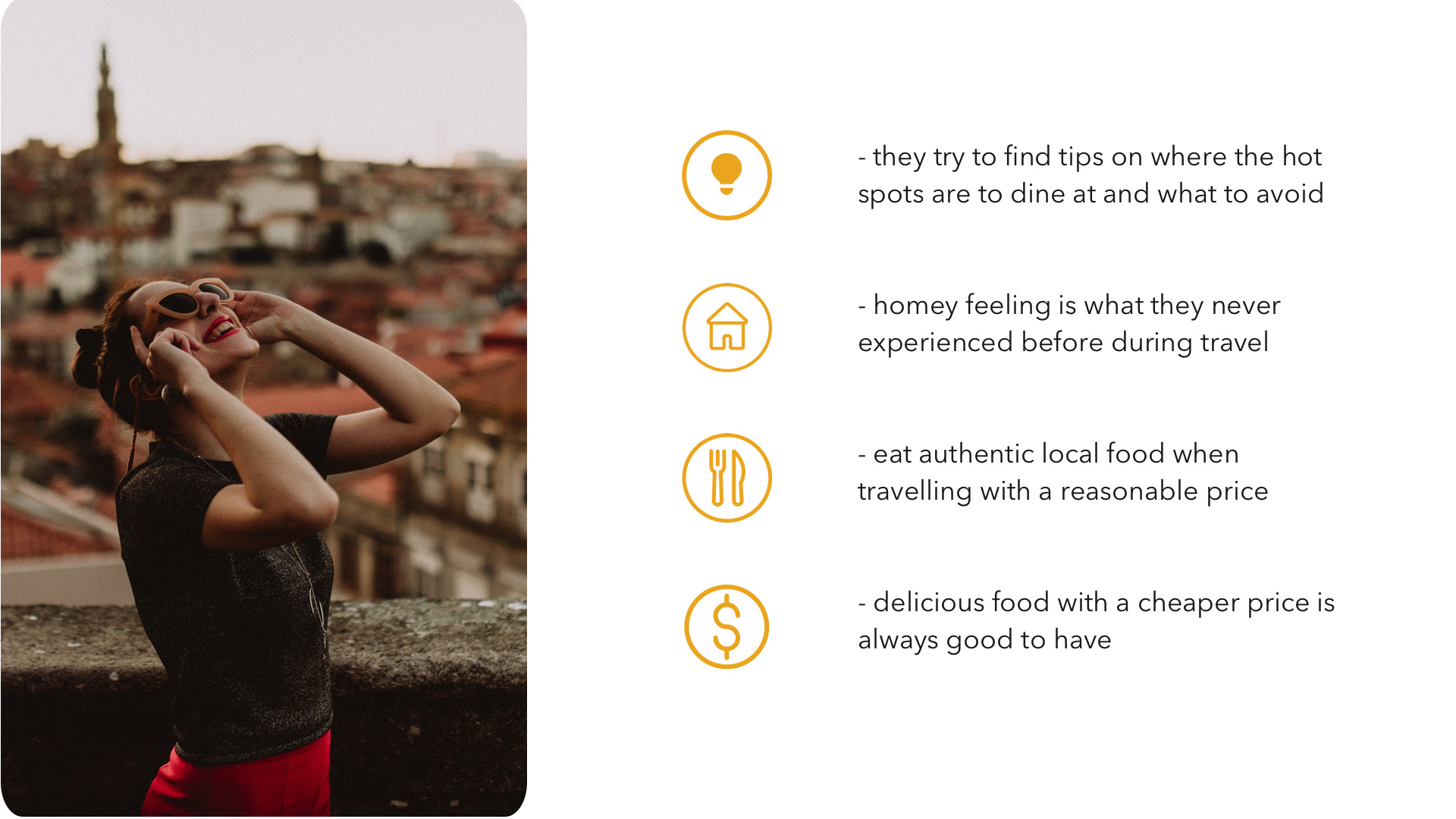
1. People want to experience authentic and unique local home-cooked food but not often in a restaurant especially when they travelling
2. People like to visit other’s home to experience different environment and cultures and have a warm and homey feeling
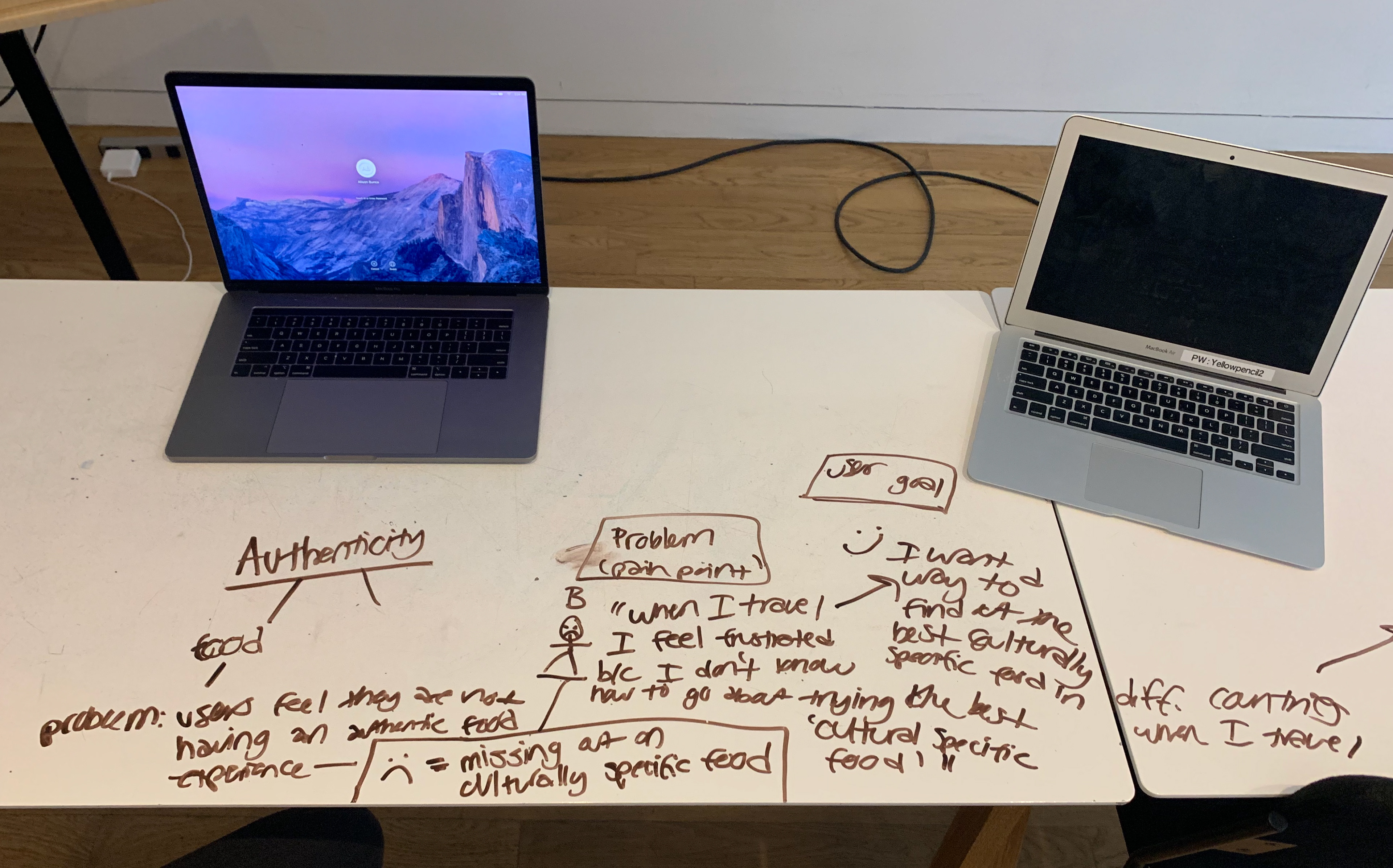
Problem Statement
Open-minded and curious foodie need a way to seek authentic local food experience during tourism because they feel good to stay local and want to have an exciting "foodcation" experience when traveling.
Also, young travellers want a way to meet new friends to visit their home to eat because they love to experience homey feeling and meet new people.
Research Findings
People travel to cities where millions of people are living but we don’t meet any local, feeling ‘lost in translation’. A majority of travellers are eager to discover an authentic food and exchange culture with locals.
The Meal Sharing Economy connects friendly hosts with hungry guests for home cooked meals in the comfort of someone’s home. This unique shared economy niche has created a worldwide network of people who enjoy both the company of others and delicious meals. It’s basically a foodie’s dream come true – and it’s definitely worth trying.
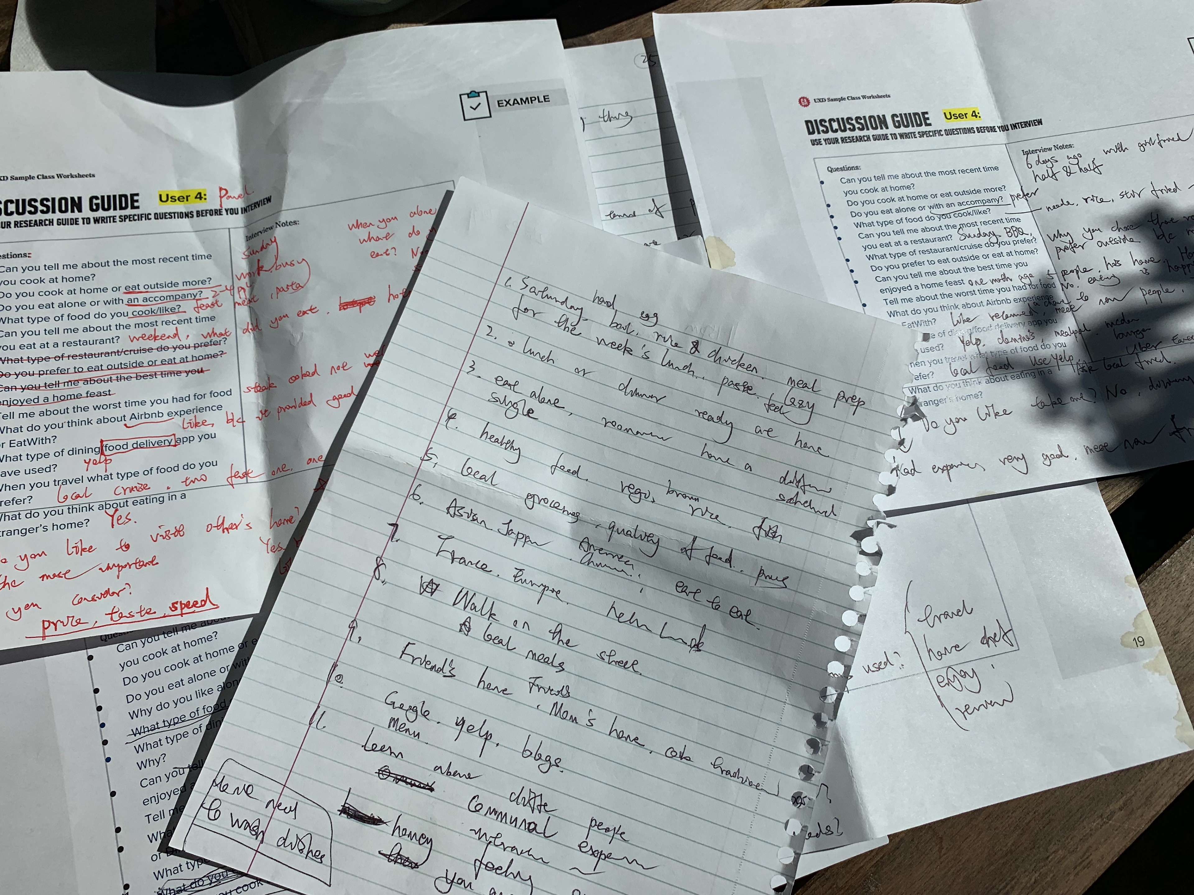
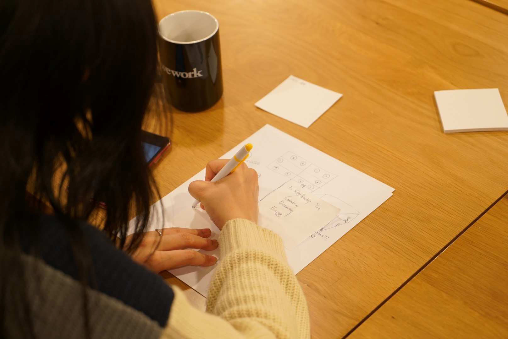
Interviews

Target Audience
Young people
Single people
Travellers
Foodies
Single people
Travellers
Foodies

Interviewed Users
1. Female, Age 34, in a relationship, Chinese, teacher, lives in Jersey City
2. Female, Age 29, single, Korean, data analyst, lives in NYC
3. Male, Age 25, Swede, Communications specialist, single, lives in Belgium
4. Female, Age 24, American, intern, single, lives in NYC
5. Female 27, Data Analyst, Single, love traveling, lives in New Jersey
6. Male, Age 31, married, Chinese, lives in Shanghai
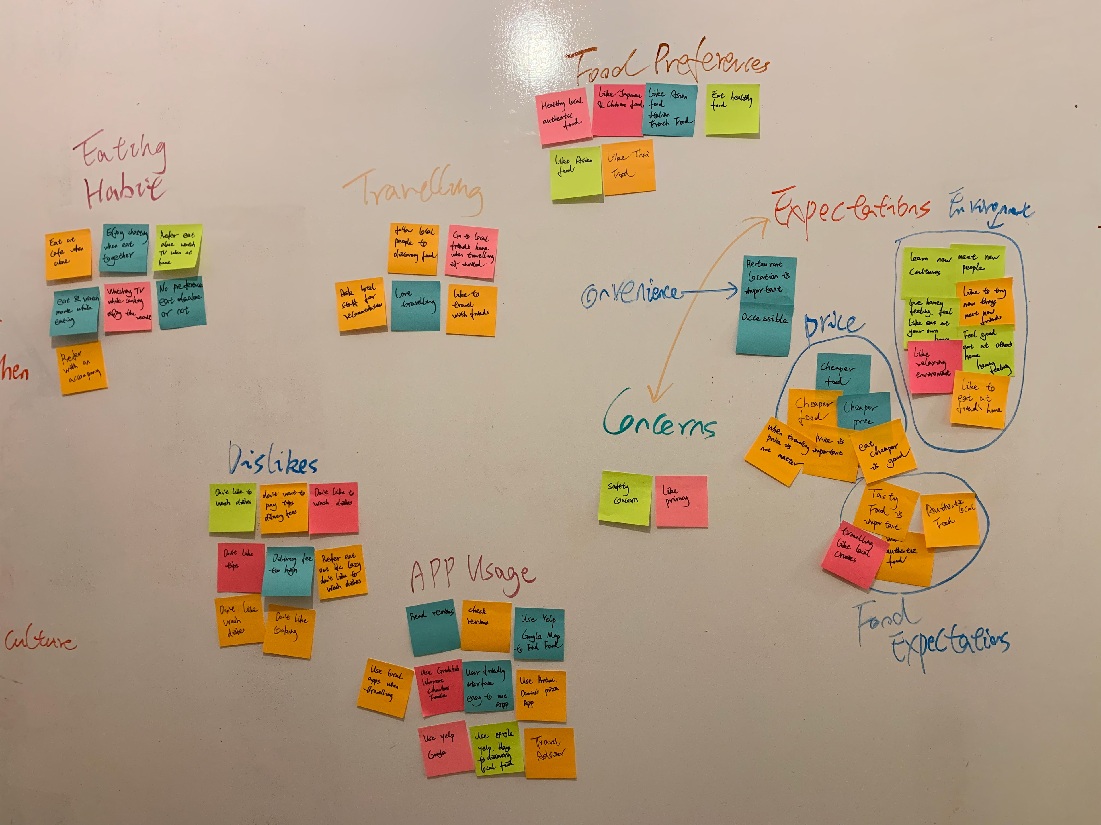
Affinity Mapping
I organized feedback into an affinity diagram which helped me to uncover common issues and frequently-encountered gaps in the user experience.


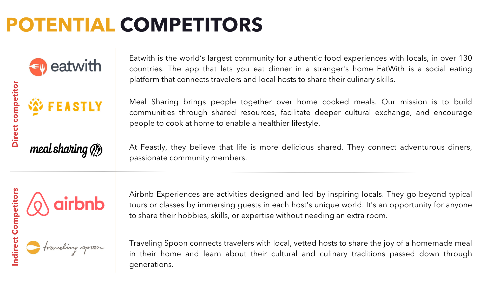
Competitors Analysis


Personas
To help me think from a users’ perspective, I created two user scenarios featuring two primary use cases of the app.


Storyboard
Donny planned to go to Paris next month, he was planning his “foodcation”. He tried to search good places to eat on different platforms. He wants to eat at local new friend’s home to experience authentic local food, also it’s a good chance for learning new culture and meet new people. Donny found a new APP “FoodCation”. He browsed, filtered searches based on his preferences. When he arrived, he went to Paris famous attractions in the morning, then went to the booked food experience. Donny felt very happy after the food experience.

Personas' Problem Statement
Dony needs a way to seek the authentic local food during tourism because he feels good to stay local and wants to have exciting foodcation experience when travelling.
Emma needs a way to find new local friends to visit their home to eat authentic local food because she loves to experience authentic local food and meet new friends.

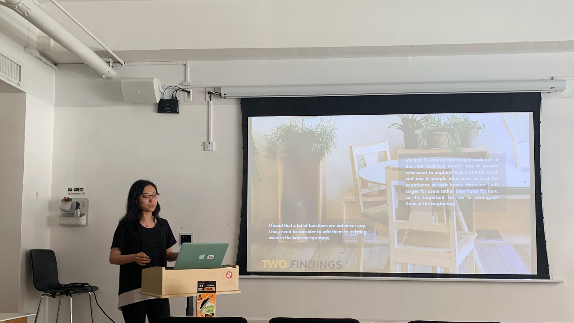
Two Findings
I found that a lot of functions are not necessary. I may need to condor to add them to existing users in the later design stage.
My app is serving two target audience in the real business model, one is people who want to explore local authentic food, and one is people who want to host the experience at their home. However, I will target for users rather than hosts for now, so it’s important for me to distinguish them at the beginning.

Card Sorting Study
Open Card Study Result (1 user)
The user created seven categories, so I believe my card contents were too detailed to sort out. So I then created five categories based on the result to continue the close card sort study.
Close Card Study Results ( 3 users)
There are three categories reached more than 70% agreement, which are reservations, profile, and search; One user named a new category as "Food". After analysis the cards he sorted, I decided to put some contents under a new category "Saved", also combined the "Host" section. I also downloaded several apps related to food, there always a section for users to save their collections, so it will easier for them to find the host and home information.
The reason I deleted the "Host" category is that this app will have two versions in reality. Mine will focus on the users' side first. The host app will be another one, if I put "Host" here, users will get confused whether it's hosts' information or become a host.
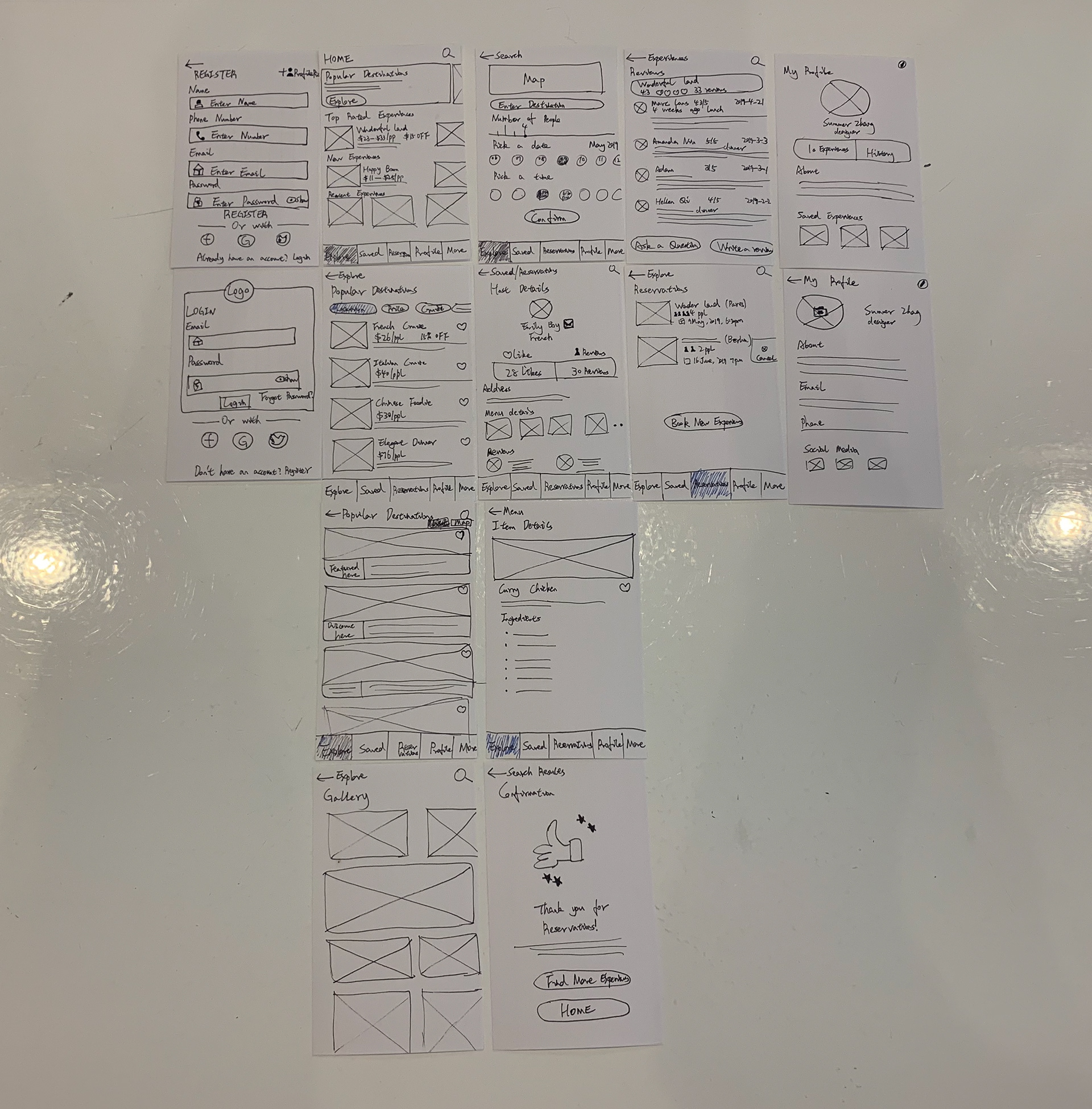
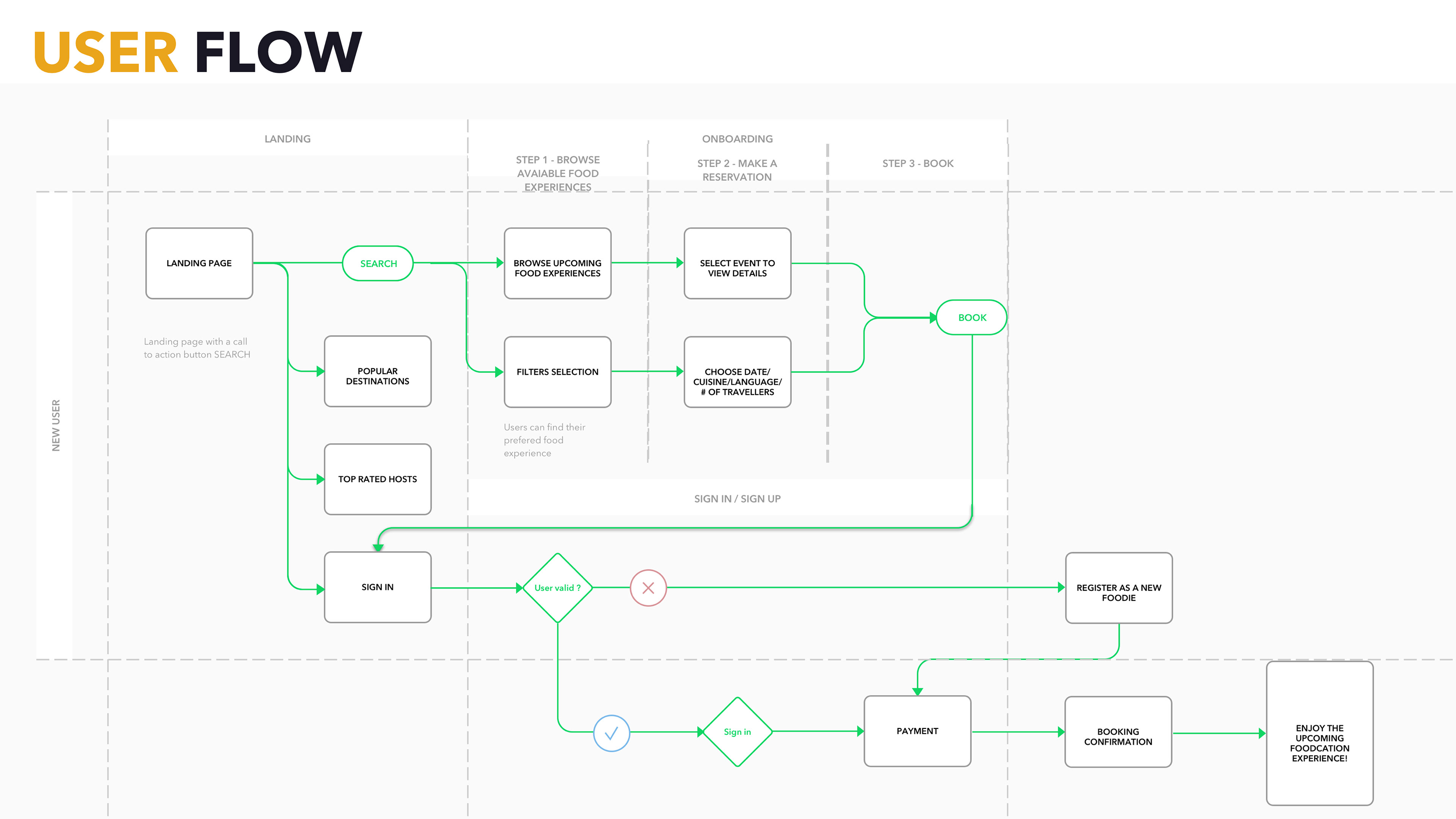
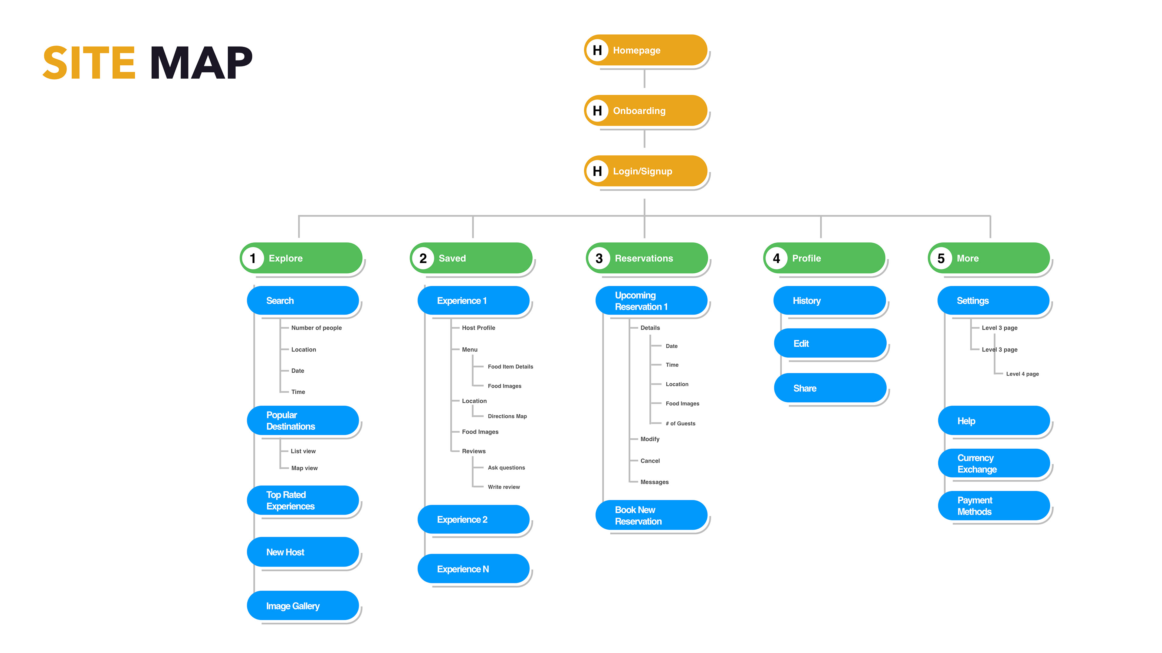
By narrowing down the features via card sorting for the necessary features for FoodCation to function. I then created a content sitemap, to give meaning to the defined features, and a site map to organize the pages, information, and navigation of the app.


Usability Testing 1
Scenario 1
Find an experience host in Maine for may 9th - booking a good experience
- navigated first to reservations
- are these previous reservations or available experiences?
- then selects book new experiences
- doesn't change the screen, so unclear where to go next
- she's unsure how to get to Maine
- then clicks popular destinations
- then chooses search
- she tested the explore option but unclear why she doesn't have more options to choose from
- "book new experience" button taking her back to the homepage and she's unclear why this isn't yielding a different view
Scenario 2
Find your saved experience
- she goes to saved
- clicks experience name
- navigated successfully!
Scenario 3
Searching an experience
- clicked the home button at top to get back to the first screen
- the hit explore
- indicated that the hearts must mean that this is the way to save her experiences


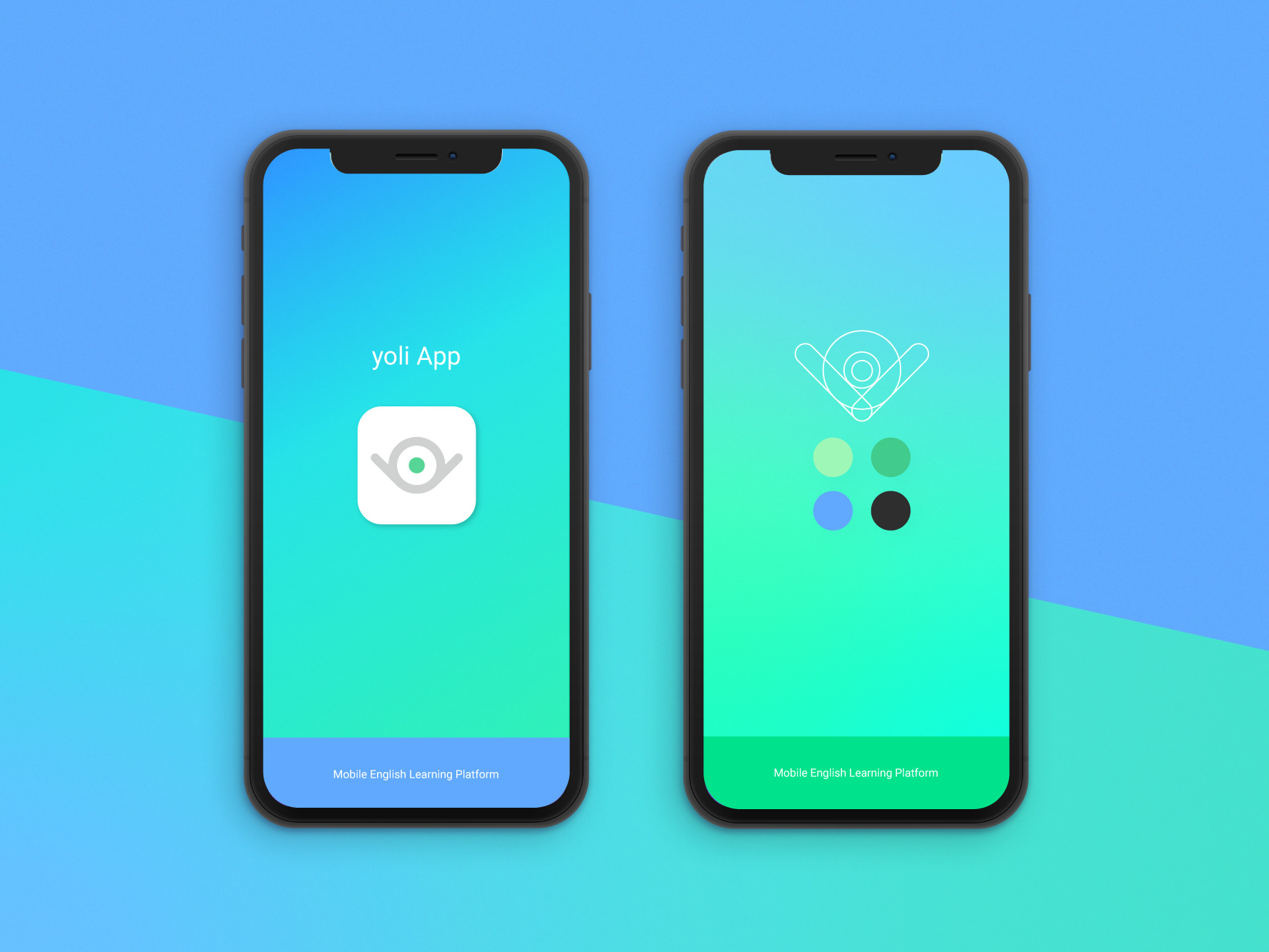
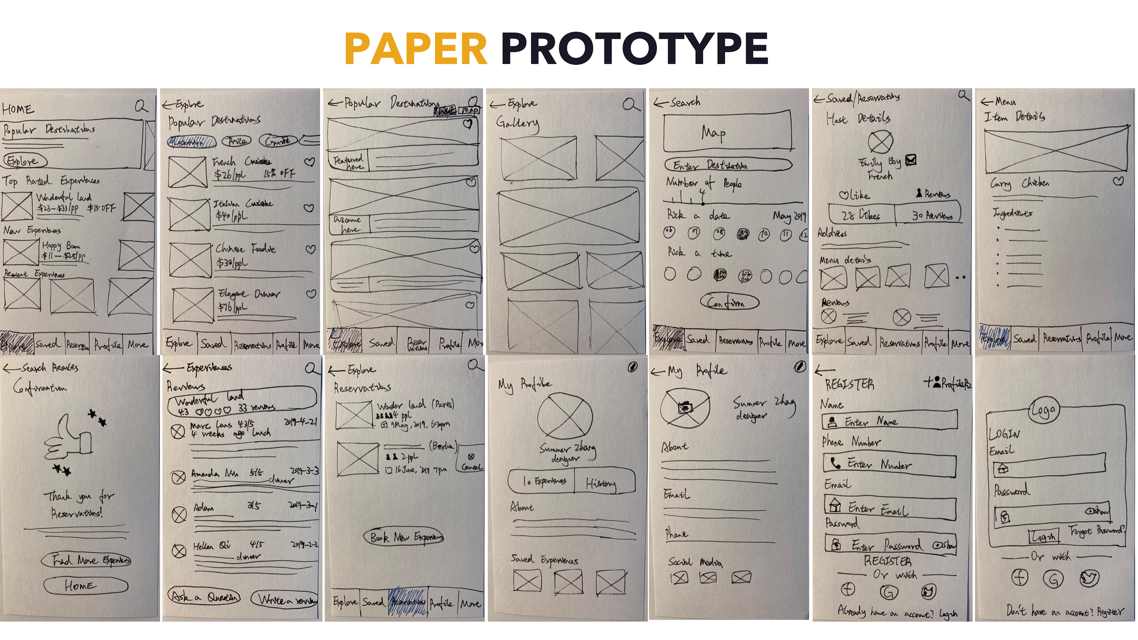
Design Mockup


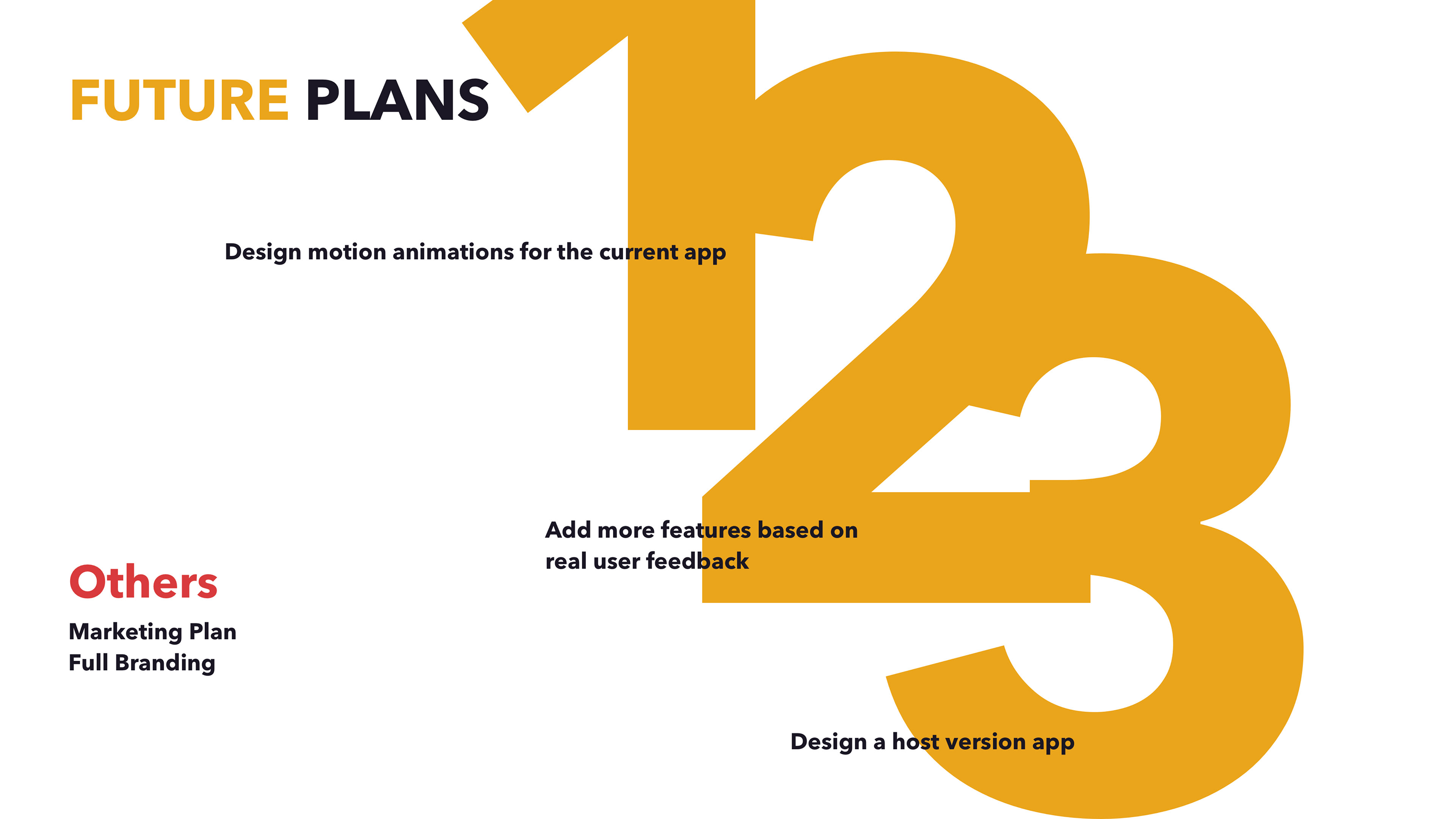
Other Processes